MORE ABOUT: Uber HQ – San Francisco, California
Building: Uber Headquarters
Location: 1455 and 1515 Third Street, San Francisco, California, U.S.
Architect: SHoP Architects
Structural Engineer: Thornton Tomasetti
MEP Engineer: AlfaTech Engineering
Status: in construction, expected completion 2020
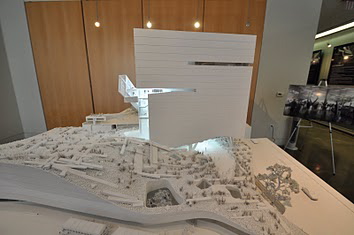
The new Uber Headquarters is expected to obtain LEED Platinum certification. The headquarters is 423,000 sf equally split between two buildings: 1455 and 1515. 1455 is twelve stories high and has a smaller floorplan while 1515 is seven stories high, having a wider floorplan. Two walking bridges connect the buildings, providing easy access and flow between a total of four floors. These bridges are rigidly connected to 1515 and have a sliding ‘T’ connection at 1455 so that, in the event of an earthquake, the bridges and 1515 will exert no force on 1455.


The Uber HQ maintains an unconventional heating and cooling design. All of the heating systems for both of the buildings reside in 1515 while the cooling systems reside in the 1455 mechanical penthouse. The utilities run under Pierpoint Lane to transfer heating and cooling needs between the two buildings. While this is not economical, the owners desired this design to avoid having chillers on the roof of 1515. With the additional space on the roof of 1515, there will be a green terrace, solar panels, and operable skylights that open/close depending on weather for natural ventilation.

Other AE mechanical interests include the raised access floors and on-site greywater treatment. The raised access floors are elevated, easily removable flooring above the structural concrete slab hiding MEPF systems such as the buildings’ radiant manifolds. The on-site greywater treatment plant resides in 1515, collecting rainwater from the buildings’ roofs and re-purposing this water for toilets, sinks, and plant irrigation.
There are hundreds of planters that need to be irrigated across 1455 and 1515’s atrium spaces. The exterior and interior facades that create the atrium have never been constructed before. The entire facade is cantilevered, requiring approximately 15′ x 20′ pile caps to maintain the structural integrity of the building. This “breathing” facade is composed of computer-controlled operable windows that open/close based on temperature, humidity, and weather to reduce HVAC energy consumption. The un-conditioned atrium serves as a buffer zone between the outdoors and the air-conditioned interior environment, further reducing HVAC needs.


Other notable architectural features of the atrium space are its stairs, ‘ice cube’ lighting, and wooden panels. The stairs in the atrium spaces are modeled based off of the hills in San Francisco, particularly the famous ‘crooked’ Lombard St. This creates a unique unparalleled flow of the building, which can be observed by the public through 1515’s glass oculus. Scattered around the atrium are ‘ice cubes’, which are massive white boxes that, when lit, look like floating ice cubes. Finally, the wooden panels that provide solar shading on the interior and exterior facades are made of oven-burned wood from Spain. No one panel is the same and each panel has several wooden members burned for different lengths, giving a variety of different colored wood.


Below are other images from the construction process as of Summer 2019.


MORE ABOUT: Perot Museum of Nature and Science – Dallas, Texas
Building: Perot Museum of Nature and Science
Location: Victory Park – Dallas, Texas
Architect: Morphosis (Thom Mayne)
Architect of Record (Dallas): Good, Fulton and Farrell
Structural Engineer: John Martin & Associates and Datum Engineers.
Preliminary Design Engineer: Buro Happold
Status Dec 2010: Under Construction


(above) Images from site visit, July 2011 – photo credit: Taylor Borchert
MORE ABOUT: Guggenheim Museum – Bilbao, Spain
More About:
Guggenheim Museum Bilbao
Location: Abandoibarra Etorbidea, 2
48011 Bilbao, España (Spain)
Built: 1993-October 19, 1997
Architect: Frank Owen Gehry
Cosentini Associates
IDOM
Structural Engineer: Skidmore Owings & Merrill LLP
Contractor: Urssa
Subcontractor: CIFER S.A.
Lighting: BEGA Gantenbrink-Leuchten KG
Total size: 24,000 square meters
Materials: Titanium, Spanish Limestone, and glass

(www.maps.google.com)
The museum’s titanium scale-like skin and curvaceous form work together to capture the light and reflect it off with fluidity also mimicking the flowing water in the nearby Nervión river.

(http://www.frillseekerdiary.com)
“Gehry has noted that each random shape and buckle of the exterior is to catch the light, so on any given day, on any given time, you could have a myriad of sparkles, created by sun on man-made materials, that might never be replicated again.” (1)

(Sony Pictures)
“Approximately a third of a millimeter thick, the titanium panels are applied using a traditional locked seam. The material’s thinness, together with it application method, results in a pillow like effect.” (2) It is inspired by the texture and shape of a fish. The inside spaces are not like traditional museum exhibits; they include curvy walls and are an exhibit of their own without overpowering the art on display.

(4) Inside of exhibit.

(http://www.guggenheim-bilbao.es)
Gehry has always designed starting by hand through sketches and for the Guggenheim in Bilbao he has moved to a more advanced technology called CATIA (Computer Aided Three-dimensional Interactive Application).
 5r
5r
(4) This is the model that was exhibited at the grand opening of the Guggenheim.
Both CATIA and BOCAD (a steel detailing program) were used in the creation of the building. CATIA significantly upgraded the level of complex forms that could be realized by Frank Gehry. This allowed for more freedom in his designs and “simplified construction by providing digital data that could be employed in the manufacturing process, thus controlling costs” (2)
CATIA Modeling Steps:
STEP 1.DIGITIZING THE PHYSICAL MODEL
STEP 2.SURFACE MODEL
STEP 3.SHADED SURFACE
STEP 4.PRIMARY STRUCTURE
STEP 5.SECONDARY STRUCTURE
STEP 5.1.CURVATURE ANALYSIS
STEP 6.SHOP DRAWING
STEP 7.THE FINISHED BUILDING
(www.arcspace.com)

(www.dac.dk and Gehry Partners LLP)
It took Gehry’s firm about “50,000 drawings and 60,000 hours of computing time to produce elements of the building façade. The splines were connected to the frame with a uni-strut adjustable joint. The joint allowed for the tuning of the splines to precisely support the titanium skin.” (3)

(4) The final elevation of the building.

(Sony Pictures)
The building attracted immense crowds and sparked a cultural and economic regeneration in Bilbao, Spain.

(4) Steel beams: The Guggenheim under construction
Sources:
1. Michael Hutagalung (http://www.frillseekerdiary.com)
2. “Frank Gehry, architect”. Colomina, Beatriz, Friedman, Mildred, Mitchell, William, Ragheb, Fiona and Cohen, Jean-Louis. Harry N. Abrams, 2001.
3. “Digital Gehry Material Resistance Digital Construction”. Lindsey, Bruce. Basel, Switzerland: Birkhäuser, 2001.
4. “Guggenheim Museum Bilbao”. Bruggen, Van. New York, New York: Guggenheim Museum Publications, 1998.
Case Study by: Pilar Guerrero
ARE320K, Fall 2010
More About: Institut Du Monde Arabe – Paris, France
More About:
Institut Du Monde Arabe
1 Rue de Fosses Saint-Bernard
75005 Paris, France
Telephone: 40.51.38.38
Built: 1981-1987
Architect: Jean Nouvel
Architectural Team: Jean Nouvel, Gilbert Lezenes, Pierre Soria
Project Manager: JJ Raynaud, Antoinette Robain, Adeline Rispail
Interior Design: Francois Seigneur
Museum Lighting: Licht Design
Museum Structure: Arcora
Map View:

Photo courtesy of Google maps
The Arab World Institute is a multi-function cultural center, including a museum, temporary exhibition spaces, a library, a documentation center, an auditorium, a restaurant, and children’s workshops.

Photo from article by Laura Puliti (http://www.floornature.com/progetto.php?id=4865&sez=30)
The Arab World Institute was designed in response to a competition for a commission from nineteen Arab states to create an Arabic culture center in Paris. The commission was the beginning of French President Fancois Mitterrand’s new policy on major works (1). The building was designed to display in grand effect the Arabic culture while simultaneously blending in to the Parisian landscape. This called for a synthesis of history and modernity of both cultures (1). The major player in this hybridization is the south facade.

Photo from online article (http://www.greatbuildings.com/gbc/arab_institute/arab_institute.html)
The south facade is a modern interpretation of the traditional Arab screen, the moucharabieh. This lattice was designed to allow air and light in while keeping women hidden from public (2). Below are traditional Moucharabieh designs.

Photo by Marie-Odile

Photo from pbase.com (name: moucharabieh-dar-si-said-01.jpg)

Photo by Panchaud Marc
In order to capture the themes of geometry and light manipulated by the patterns of the moucharabieh, camera shutters were used to create a miasma of circles and poylgons. The shutters are all linked to a central computer which controls how much light is allowed into the structure by manipulating the shutters, all 25000 of them (2). The pictures below show the attention to detail of the shutters and the control of light they posses.

Photo by Georges Fessy

Photo by Guen-K

Photo by Debbie at Delicious Baby Travel blog

Photo by David F. Gallagher

Photo from Pixelmap.com
In order to fully integrate the shutters into the modern-arabic design, the mechanisms were inserted between two layers of glass. This paralleled the sophistication of screens set at intervals of wood and marble of traditional Arabic design. It took two years to develop a working prototype (2).

Photo by Quique
The north facade of the building does not have to work with variable lighting conditions as the south face does, and thus has a simpler, cleaner profile. To mirror the modernity of the Parisian landscape and highlight the use of light in the building, a silk-screen was attached to the north facade depicting an “abstract skyline” (2). The reflectivity of the surface mirrors the pride and beauty of the surrounding buildings.

Photo from Pete Sieger

Photo from worldtravelimages.net
The focus of this building, as made apparent from the previous information, was the manipulation and molding of light. The building invokes a sense of transparency with many levels of glass faces for depth, framed and filtered by the structure itself. The staircases and cylindrical book tower are excellent examples of the use of light and structure (1). The structure’s complexity of steel members and frames adds to the Arabic weave of the environment.

Photo by Tara Bradford

Photo by Allison Meier
Another continuation of the Arabic motif is the spatial play of size and space in form. The halls and rooms expand and constrict in manners similar to the mosques of the east. Also, a hypostyle room reflects the influence of the ancient mosques in a modern fashion. In the middle of the building there is an open courtyard which takes its roots from the central fountains of the middle east. The plan below displays this synthesis of forms.

Photo from Jean Nouvel projects page
Below the use of structural components (concrete pillars) can be seen in harmony with the design of the space. The structure is part of the design.

Photo by Laura Puliti
The Arab World Institute used state of the art design and construction in order to capture the spaces and light as Jean Nouvel required. Consultants on concrete structures and glazed facades were brought in to analyze the plans. Intricate construction involving aluminum trim on structural components and custom bolts and frames added to the complexity, and ultimately beauty, of the building. The effect of the finished product was to create a translucent surface that “stretched like skin” across the structure (1). The goal was to create a work that maximized space as well as form.

Photo from Jean Nouvel projects page

Photo from kottke.org

Photo from Debbie (deliciousbaby.com)

Photo by Scott Norsworthy
Case study by: Garrett Jones
ARE 320K, Fall 2010
Other sources (UT Library):
Books:
(1) Boissière, Olivier, and Jean Nouvel. Jean Nouvel. Basel: Birkhäuser, 1996. Print.
(2) Bosoni, Giampiero. Jean Nouvel. Geneve: Skira, 1999.
MORE ABOUT: de Young Museum – San Franscisco, California
Building: de Young Museum
Location: 50 Hagiwara Tea Garden Drive, San Francisco, CA 94118
Completion: October 2005
Client: de Young Museum
Primary Designers: Herzog & de Meuron
Principal Architects: Fong & Chan Architects
Landscape Architects: Hood Design
Herzog & de Meuron Team:
Project Architect: Ascan Mergenthaler
Project Manager: Jayne Barlow
Fong & Chan Team:
Project Manager: Nuno Lopes
General Contractor: Swinerton Builders
Project Manager: Mike Strong
Structural Engineers: Rutherford & Chekene
MEP: Ove Arup Group and Partners
[1]
The original de Young Museum was founded in 1906 by Michael de Young with the goal of putting San Francisco on the financial map [2]. This museum stood for nearly one hundred year before an earthquake in 1989 and numerous additions eventually made the building unsightly and uninhabitable.

Herzog and de Meuron were commissioned to build a replacement museum, but were a controversial pick because many people thought they were too young, dramatic, or unknown [2]. Although doubted, Herzog and de Meuron created a building that was appreciated for its architectural value, but did not overwhelm the site.

Jacques Herzog understood that the building needed to fit into the landscape, but the design team also wanted a building that was always changing [3]. The copper skin of the de Young is intentionally manipulated with some smooth surfaces and others that are bumpy or perforated to “oxidize with poetic unevenness” [3].


Part of preserving the natural site included keeping pieces from the original building [1]. Historical elements preserved in the new building site include palm trees and the Pool of Enchantment.

The most recognizable part of the building is the tower on the front side [3]. The shape is unique in design as it “rises from a rectangular footprint to a non orthogonal parallelogram.” Thus, the shape of the tower allows the building to further sink into the surrounding landscape as from some angles the tower almost disappears.


On the interior, the building consists of several courtyards that allow visitors to see outside and enjoy the natural surroundings as well as the art [4]. Additionally, Herzog and de Meuron did not want the building to have one main entrance, therefore they gave the museum four entrances [2].


As with any museum, light played an important factor with the desing of individual spaces [4]. Herzog and de Meuron also sought to show no favoritism to specific art rooms. They strived to make each room just as appealing for art as the next, while making each room accessible from the main walkways.


Ultimately, Herzog and de Meuron accomplished their goal of creating an art museum that could display sufficient amounts of art without being overbearing on the site.


Sources:
Herzog and de Meuron, de Young Museum. <http://www.arcspace.com/architects/herzog_meuron/de_young.html>
Nicholson, Louise. “Herzog & De Meuron’s new, copper-clad de Young Museum in San Francisco ingeniously bonds with its setting.” Apollo Dec. 2005: 17+. Academic OneFile. Web. 14 Sept. 2010.
For San Francisco’s de Young Museum, Herzog & de Meuron create a new building with a sensual copperskin that will evolve over time. Architectural record [0003-858X] Amelar yr:2005 vol:193 iss:11 pg:104 -115
Ketcham, Diana. The de Young in the 21st century: a museum by Herzog & de Meuron. New York: Thames & Hudson, 2005.
MORE ABOUT: Linked Hybrid – Beijing, China
MORE ABOUT:
Linked Hybrid
Built: 2003-2009
Architect: Steven Holl Architects
Structural Engineer: Guy Nordenson and Associates, China Academy of Building Research
Mechanical Engineer: Transsolar,Beijing Capital Engineering Architecture Design Co. LTD, Cosentini Associates
Linked Hybrid is a multifunctional urban complex consisting of eight towers connected by skybridges in a semi-lattice-like form. The complex is described as an “open city within a city” which includes spaces for residential, commercial, educational and recreational use. The design promotes the use of shared resources while also diminishing the need for unnecessary transit.
 [1]
[1]
 [1]
[1]
The eight towers have concrete exoskeletons that diminish the need for interior columns and allow the residential apartments to vary in size and design. The apartments also contain adjustable panels for reconfiguration.
 [2]
[2]

[3]
The skybridges connect to the towers by four roller mounts called isolators which allow for their own independent movement during earthquakes. The bridges all differ in slope and are designed to maximize transparency and allow for optimal light.
 [3]
[3]
 [3]
[3]
Five multistory, steel cantilevers at 33 feet long rest on top of the towers and are supported by a reinforced concrete diagrid in the exoskeleton. Polychrome lights inspired by ancient Chinese temples line the undersides of the cantilevers, skybridges, and the window jambs.
 [3]
[3]
 [3]
[3]
655 Geo-thermal wells each at 100 meters below the base of the structure provide an estimated 70 percent of all cooling and heating needs for the building. The placement of these mechanical systems underground reduces noise pollution, lowers CO2 emissions and opens up roof space for green landscapes.

[1]
 [2]
[2]
Linked Hybrid utilizes water recycling techniques that pipe used water from apartments and the greywater pond into ultraviolet filtered tanks and redistributes the water back to the apartments and also waters the surrounding landscapes. 220,000 liters of water are recycled daily and the building is credited with a 41 percent decrease in potable water usage.

[2]
Case Study by: Brandon Long
ARE 320K, Fall 2010
Sources (UT Library):
Article:
“Steven Holl Architects: Linkwd Hybrid, Beijing 2003-08.” Lotus International Mar. 2010: 64-71.
Pearson, Clifford A. “Connected Living: Steven Holl’s Linked Hybrid in Beijing Provides a Vision of Mixed-use Development That Engages the City around It and Operates Sustainably.” Architectural Record Jan. 2010: 48-55.
“Linked Hybrid, Beijing, China.” GA Document Dec. 2009: 40-55
Photo Credits:
[1] Steven Holl Architects (website)
[2] Iwan Baan (website)
[3] Flickr (website)
MORE ABOUT: Cy Twombly Pavilion – Houston, Texas
MORE ABOUT:
Cy Twombly Pavilion, the Menil Collection
1519 Branard St
Houston, TX
Built: 1995
Architects: Renzo Piano Building Workshop
Structural Engineer: Ove Arup & Partners, Haynes Whaley Associates Inc.
The Cy Twombly Pavilion is an adjunct to the Menil Collection and houses a permanent collection of paintings, sculptures, and drawings by Cy Twombly.


The outside of the building is composed of concrete panels which contrast the effect of the floating roof.
Here is a plan of the ground floor and building sections showing the roof support system.

(Source 1)
The most challenging aspect of the building is the roof which must diffuse harsh sunlight to bring in the right amount of light. The roof structure is composed of 4 layers:
-diffusing louvers
-glass envelopes
-adjustable, motorized louvers
-cloth/translucent ceiling
(web article on the “floating roof”)


(source 1)
The last layer, the cloth ceiling conceals the roof details from the inside and also makes it possible to add additional, artificial light through holes in the cloth.

(Read more about the Cy Twombly Gallery)
Case Study by: Kaylyn Fenner
ARE 320K, Fall 2010
Other sources (UT Library):
Article:
“Art House.” Architectural Record. May 1995 v.183: 80-83.
Article:
“Softly Piano.” Texas Architect. Jul.-Aug. 1995 v.45: 62.
MORE ABOUT: Millennium Bridge – London, United Kingdom
Structure: Millennium Bridge
Type: Suspension
Location: Bankside to the City of London, England
Completed: February 2002
Engineer: Arup
Architect: Foster and Partners
Artist: Sir Anthony Caro
Contractors: Monberg Thorsen and Sir Robert McAlpine
Map
The design for the Millennium Bridge began in 1996. The height restrictions due to the bridge’s location required a unique design for a shallow suspension foot bridge spanning three hundred and thirty-three feet. The cable sag is a mere 2.3 meters.

The unusual profile for the cables created concern about the structure’s stiffness and response to torsion. Extensive analysis was conducted to make sure the tension in the cables would stabilize the bridge enough to meet lateral stiffness standards. The cables were placed wide from the bridge to resist torsional forces.

Despite the extensive analysis, on opening day the bridge experienced strong lateral vibrations. While no vertical vibrations were experienced, the lateral vibrations were strong enough to make many pedestrians grab onto the rails. Two days later, the bridge was closed for investigation.

Many tests were conducted and a theory of synchronous lateral excitation was proposed. This phenomenon results when a large number of people cross the bridge, all contributing a minuscule lateral force that is typically neglected in design analysis. The sensation of lateral vibration becomes noticeable because the pedestrians often find it more comfortable to step in synchronization with the bridges slight lateral movements, therefore creating a large force in time with the bridge’s natural frequency, eventually exaggerating the lateral movement. The investigation included studying bridges that also demonstrate this phenomenon, proving that the sensation is not unique to the Millennium Bridge’s unusual shallow cable design.

Thirty-seven viscous dampers were installed to control the horizontal motion, and twenty-nine pairs of tuned mass dampers to control vertical motion.
While synchronous lateral excitation had previously been witnessed, the extensive research into it was a break through in bridge design and stands as the Millennium Bridge’s main contribution to the engineering world.
References:
Pat Dallard, Tony Fitzpatrick, Anthony Flint, Angus Low, Roger Ridsdill Smith, Michael Willford and Mark Roche, “London Millennium Bridge: Pedestrian-Induced Lateral Vibration”, J. of Bridge Engineering, Trans. ASCE, 6, 412-417 (2001).
P. Dallard et al. “The London Millennium Footbridge”, The Structural Engineer, 79, No. 22, 17-33 (2001).
MORE ABOUT: Valencia City of Arts – Valencia, Spain
MORE ABOUT:
Valencia City of Arts and Sciences
PROLONGACION PASEO ALAMEDA, 48, 46023 València, Spain
Built: 1994-2004
Architects: Santiago Calatrava, Felix Candela
Structural Engineers: Calatrava

The Valencia City of Arts and Sceinces is located on the dried up river bed of Turia River. It covers a 350,000 square meter area.

Calatrava designed most of the complex alone with the exception of Le Oceanografic which was designed by Felix Candela. The complex is comprised of a Science Museum, Plantarium, Opera House, Promenade and Parking Structure.

The use of white concrete and fragments of shattered tiles throughout gives the entire complex a sense of continuity. Calatrava also designed two bridges which provide the prinicipal mode of transportation throughout the complex.

Original sketches done by Santiago Calatrava outline the layout of the Valenencia City of Arts and Sciences


L’Hemisferic derives its form from the human eye and functions as an Imax theatre and planetarium. Each side of the eye-shaped building opens and closes like the eyelids of an eye


Calatrava’s L’Umbracle is an exotic garden

Museo de las Ciencias Principe Felipe derives is form from the skeleton of a whale.
_(472712279)")

Construction on El Palau de las Artes Reina Sofia, the Opera house for Valencia, was complete in in 2004.
Case Study by: Lauren Ramos
ARE 320K, Fall 2010
Other Sources (UT Library):
Books:
Sharp, Dennis. Santiago Calatrava. London, England: E & FN Spon, 1997.
Tzonis, Alexander. Santiago Calatrava’s Design Process. Basel, Switzerland : Birkhäuser, 2001.
MORE ABOUT: Tod’s Omotesando – Tokyo, Japan
MORE ABOUT:
Tod’s Omotesando
5-1-15 Jingumae, Shibuya-ku
Tokyo, Japan
Built: 2003-2004
Architect: Toyo Ito, Takeo Higashi, Akihisa Hirata, Kaori Shikichi, Leo Yokota, Takuji Aoshima, Yasuaki Mizunuma
Structural Engineer: OAK Structural Design Office
Mechanical Engineer: ES Associates
General Contractor: Takenaka Corporation
Toyo Ito’s Tod’s Omotesando is an Italian shoe and bag retailer located in Tokyo’s luxury brand shopping district.

This L-shaped building fits tightly between a cosmetics shop and a piano showroom with only 33 feet of prime street space.

The unique facade on Tod’s Omotesando resemble the zelkovas, elm-like trees lining the Omotesando boulevard. There are a total of 9 overlapping tree silhouettes surrounding the six exterior walls. According to Ito “trees are organisms that stand by themselves, so their shape has an inherent, structural rationality.” The branches of the facade “grow” thinner at the top and thicker at the bottom [1].


The concrete facade together provides for column free floors within the complex. The exterior walls are 12 inches thick and act as both load-bearing elements and surface treatments [1].


The Structural Design Office OAK used “soft concrete with a high slump factor and two layers of wooden formwork to realize all the precise and uniquely shaped pieces” [1]. Glass panes, and in some areas aluminum panels, are inlaid between the concrete branches [2].

Each floor in the interior of Tod’s Omotesando has a unique floor plan. The stairs are comprised of sculptural glass, steel, and travertine and are located in the front or the back of the store, close to the supports provided by the exterior. The sixth floor is an 18 foot high events room, and on the roof of the building sits a glass meeting room and a private dining room [1].


Tod’s Omotesando is an innovative building in Tokyo, Japan. The facade brings in customers from off the street, and the interior layout keeps these customers entertained inside. Ito’s building contributes to the success of the shopping district and in this case form definitely follow function.
Case study by: Kartik Sampath
ARE 320K Fall 2010
Other Sources (UT Library):
Article:
[1] “Tod’s Omotesando Building in Tokyo.” Architectural Record. Apr.-Jun. 2005 v.193: 79-85.
[2] “Tod’s Omotesando.” Japan Architect. Winter 2006. n.60. p.38-39.
MORE ABOUT: Burj Khalifa – Dubai, United Arab Emirates
MORE ABOUT:
Burj Khalifa (Formerly Burj Dubai)
Dubai, United Arab Emirates
Map
AEWorldMap Entry
Completed: January, 2010
Architect: Skidmore, Owings and Merrill (Adrian Smith)
Engineer: Skidmore, Owings and Merrill (Bill Baker)
Project Manager: Turner International
Main Contractor: Samsung Corporation (South Korea)
Developer: Emaar Properties


The Burj Khalifa (Khalifa Tower in Arabic) is currently the tallest building in the world and measures 2,717 feet from its base to the tip of its over 700 foot tall spire. It rises 1000 feet higher than the world’s now second tallest building, Taipei 101. Skidmore, Owens and Merrill was responsible for the architecture, most of the engineering, and the interior design of this building. (Source 1)


The 160-floor tower lies within a master planned 500 acre community; all of which didn’t exist 6 years ago. (Source 1)

Burj Khalifa houses hotel space on the lowest floors, residential space on the mid level floors, and office space on the highest inhabitable floors. The building’s triaxial geometry and y shaped plan make it ideal for residential/hotel use, because they give more surface area per unit (i.e. more windows), rather than larger interior spaces (which would be more ideal for office use). (Source 1)

It’s obvious that the office floors (below — typically around only 5,000 square feet of floor space each) were more of an afterthought, as the entire building was designed for residential use. (Source 2)

A hexagonal core surrounds the elevators, and since it would not have been big enough to span the necessary height on its own, it is buttressed by the three wings of the building. One wing at each tier “sets back” in a spiraling pattern. (Source 2)

Wind was of great concern to the designers of the Burj Khalifa, as it’s speed increases with height. The main influence in the structural design process was, therefore, wind force. In depth wind tunnel testing on models of the building actually led to it’s rotation by 120 degrees to allow for the highest wind loads to be located the noses of the building. Just as well, the building houses some of the fastest elevators in the world (57 to be exact), although none travel farther than around 1,600 feet. In case of fire, refuge areas on certain floors can safely house the building’s habitants to prevent any unnecessary walking down potentially hundreds of flights of stairs. (Source 2)


The interior spaces (above) were designed with regard to an organic subtlety and are meant to directly contrast much of the grandiose nature of the building’s exterior and the city at large.

(Taken from the observation level at the Burj Khalifa)


The developer, Emaar Properties, along with the Architect and Engineer (SOM) were more focused on the scale of this building, rather than it’s sustainability (this caused great criticism upon opening in 2010). In their defense, the concept of sustainability wasn’t nearly as commonplace in building design (or in any industry, really) during the first half of the decade as it is today. (Source 1) Overall, though, Burj Khalifa serves as an outstanding symbol of the advancement of building technology in the world, and furthers Dubai and the UAE’s position as an “international player on par with other major cities.” (Source 2)

Case Study by: Blake McGregor
ARE 320K, Fall 2010
References:
Articles:
Source 1
Renzi, J. “Product Focus: Burj Khalifa and Citycenter.” Architectural Record. 198.8 (2010): 47-49. Print.
Source 2
Minutillo, Josephine. “Architectural Technology the Burj Khalifa’s Designers Tackle Extreme Height and Climate to Create an Icon.” Architectural Record. (2010): 89. Print.
Source 3
Shapiro, G.F. “Detail: Burj Khalifa Curtain Wall.” Architect. 99.3 (2010): 23-24. Print.
MORE ABOUT: Seattle Central Library – Seattle, Washington
MORE ABOUT:
Seattle Central Library
1000 4th Ave
Seattle, WA 98104
Map of Location
Completed: 2004
Architect: OMA and LMN
Structural Engineer: ARUP/ Magusson Klemencic Associates
Awards: 2005 Honor Award for Outstanding Architecture, 2005 Outstanding Library Building Award, and 2005 Platinum Award for Innovation and Engineering
The Seattle Central Library is composed of five overlapping platforms with four clusters in between to fill the voids.


Due to the complex geometry of the building “the architect of the facade evolved through several highly distinct iterations including several metal and glass cladding configurations”(1) Below are some sketches of the different iterations.


Here are some structural diagrams of the finalized plan. The facade ended up being made of steel and glass.

Here is a photo of the construction phase as well as a close up of the facade from the inside.


“To favor an organic approach the book spiral arranges the volumes on a continuous ribbon of shelves.”(2)


Below are some interior shots: specifically the greeting escalator and the 2nd floor. Both show the unique use of color in the spaces.

copyright: Fernando Herrera

copyright: Fernando Herrera
(Web article on sustainability of the space)
(Architects Website)
Case study by: Sarah Turner
ARE 320K, Fall 2010
Other Sources(UT Library)
Article:
(1) “OMA/LMN- Seattle Central Library.” A+U Journal. Jan. 2005 n.1, v. 412: 150-167
(2) “Genetic Algorithm.” Lotus International. 2006 n.127: 52-65
New Museum of Contemporary Art – New York City, New York
Building: New Museum of Contemporary Art
Location: New York, New York
Design/Construction Team and Product Info
Source: http://archrecord.construction.com/projects/bts/archives/museums/0803_NewMuseum/specs.asp
Owner:
City of New York
Client Representative:
Zubatkin Owner Representation, New York City
Marty Zubatkin, President
Andy Bast

Architect:
Kazuyo Sejima + Ryue Nishizawa / SANAA
7-A, 2-2-35, Higashi-Shinagawa, Shinagawa-ku
Tokyo, 140-0002
Japan
Tel: +81.33450.1780
Associate Architect:
Gensler, New York City
Madeline Burke-Vigeland, Principal
William Rice, Project Manager
Karen Pedrazzi, Kazuyo Sejima + Ryue Nishizawa / SANAA
Kristian Gregerson
John Chow
Will Rohde
Sohee Moon
Christopher Duisberg
Edgar Papazian
Education Center Interiors 5th Floor:
Christoff: Finio Architecture
Martin Finio and Taryn Christoff, Principals
_____________________________________

Executive Structural Engineer:
Simpson Gumperts & Heger Inc., New York City
James C. Parker, Principal
Kevin Poulin, Project Engineer
Fillipo Masetti
Structural Engineer:
Guy Nordenson and Associates, New York City
Guy Nordenson, Principal
Brett Schneider, Project Engineer
SAPS – Sasaki and Partners (competition)
Mechanical/Hvac Engineer:
Arup
Raymond Quinn, Principal
Camille Allocca
Plumbing:
Arup
Fire Protection:
Victor Gomez
Electrical Systems:
Arup
Elizabeth Perez, Swan Foo
Code Consultant:
Jerome S. Gillman Consulting Architect, P.C.
Jerome Gillman,
Larry Gillman, Orlando Diaz, Jozef Vasko
Facade Consultants:
Simpson Gumperts & Heger Inc., New York City
James C. Parker, Principal
Sean O’Brien
Vertical Engineering:
Jenkins & Huntington, Inc.
Transportation Kevin Huntington, President
Tom Terhaar
Audio/ Visual And I.T. Consultant:
Arup
Peter Berry
Raj Patel, Chris Taylor, Adriana Sangeorzan
Security Consultant:
Ducibella Venter & Santore
Philip Santore, Principal
Brian Coulombe
Lighting Consultant:
Tillotson Design
Suzan Tillotson, Principal
David Buyra
Food Facilities Consultant:
Post & Grossbard
Henry Grossbard, Principal
Cody Hicks
Waterproofing/ Roofing Consultant:
Henshell & Buccellato
Justin Henshell
Paul Buccellato
Fire Alarm Consultant:
Acotech Services
Sid Aconsky
Geotechnical Engineer:
Langan Engineering & Environmental Services
Brian Ladd
Concrete Consultant:
Azzerone
Alan Bouknight
Cost Estimators:
Stuart-Lynn Company, Inc.
Breck Perkins, Principal
_____________________________________

Project Management:
Plaza Construction Corporation, New York City
Richard Wood, President
Christopher Mills, John Nowak Sr.
Construction Management:
Sciame, New York City
Frank J. Sciame, Principal
Construction Team: Michael Porcelli, Mark Pankoff, Susan Ospina, Lou Silbert, Kyle Rolf, Anthony Turturro, Rich Bergen, Andrew Sciame, Charles Hsu, Ralph Thompson, Darrin McIntyre, Adam Giusti
Contractor:
Cord Contracting Company. Inc., NY
Structural steel stud framing: Marino Ware
Gypsum sheathing: DensGlass Gold, Georgia Pacific
Waterproofing: Henry Air-Block, Henry Company
Products:
Superstructure:
Steel structure with concrete slab on composite steel deck. Concrete foundation walls and mat foundation.
Exterior Materials:
Expanded aluminum mesh (anodized) mounted with stainless steel clips on painted extruded aluminum liner panel, Structural stud exterior wall; Glass windows in painted aluminum frames;
Low iron glass storefront with anodized aluminum mullion system; Glass fritted skylights covered with aluminum grating
Interior Finishes:
Public Areas: Polished concrete floors, drywall, metal mesh ceilings
Galleries: Polished concrete floors, drywall, exposed ceilings
Offices: Carpeted floors, drywall, drywall Ceilings
Multi-purpose Room 7th floor: Poured epoxy floor, low iron glass storefront windows wrapping space to terrace, drywall, acoustical plaster Ceiling
Façade Cladding:
Contractor: McGrath Inc., Minneapolis, USA
Expanded aluminum mesh with anodized finish (custom):
Expanded Metal Company, UK
Stainless steel mesh clips (custom): James & Taylor, UK
Mesh and clip engineering / procurement: James & Taylor, UK
Extruded aluminum liner panel (custom): McGrath Inc.
Windows:
Contractor: Competition Architectural Metals Inc., NY
Aluminum frame windows: Wausau Windows
Glass: Viracon
Storefront:
Contractor: Competition Architectural Metals Inc., NY
Curtain Wall:
Aluminum curtainwall mullion: US Aluminum
Glass: Starphire
Glass door pivot hardware: Rixson
Glass door handles: C.R. Laurence Co.
Loading dock doors (custom): Competition Architectural Metals Inc.
Interior Wall:
Contractor: Cord Contracting Company. Inc., NY
Gypsum board: USG
Stud framing: Marino Ware
Paint: Sherwin Williams
Skylight:
Contractor: Atlantech
Skylight system: Supersky
Glass: Solarban, PPG
Lighting:
Contractor: Dooley Electric, NY
Fluorescent lighting: Bartco Lighting
Gallery busway lighting: LSI
Downlights: Lucifer Lighting Company
Custom Millwork:
Contractor:
Miller Blaker Inc., NY
Lobby, Café
Museum Store
Elevator:
Fujitech
Epoxy Floor 7th Floor:
Tennant Flooring
Glass Tiles: Bathrooms
Bisazza
Acoustical Plaster Ceiling 7th Floor:
Star-Silent, Pyrok
Plumbing:
Faucets: Vola
Toilets/urinals: Toto
Doors/Frames: Michbi Doors Inc., NY
MORE ABOUT: Synagogue – Munich, Germany
The Synagogue in Munich, built in 2007, features a special cube shaped atrium rising out of the sanctuary (figure 1). The atrium is a delicate combination of a steel cage structure supporting aluminum and glass, shrouded in a bronze mesh which helps filter the light coming in. To understand the details of the central atrium it helps to appreciate the symbolism and cultural significane behing it. The cube which rests atop the stone structure below it is is structural independent and sits on its 4 corners. With its self supporting structure, the cube is reminiscent the Temple of Soloman with its mobile, tabernacle tent.
 Figure 1
In addition, the structure which is composed of tessalating steel triangles conveniently creates the image of the six-pointed star of david repeating on its facade (figure 2).
 Figure 2
A more suble feature of symbolic significants is the use of 3 different metals to construct cube (Figure 3: Roof and Wall Contruction) The way the three metals interact with each other and the environment creates a dynamic similar to the story of conflicts between various people of Europe. The steel structure attaches to the aluminum which holds the glass envelope. and also stainless steel posts which support the bronze skin. All three of these metals have the potencial to corrode each other over a long period of time if not in proper contact.

The structural independence of the cube atrium allows for a all four sides of it to be open so that worship can be practiced from three of those sides. This independence is also utilized to allow a sky light on the side of the sanctuary where the choir performs (Figure 4)
 ( Figure 4)
MORE ABOUT: Kielder Observatory- Northumberland, United Kingdom


Kielder Observatory is stationed in Kielder Forest, in what could be the darkest, least light-polluted location in all of England. Designed by Charles Barclay Architects, here the observatory can view the sky in an unadulterated view, free of the distraction of a functioning city. The structure was created with the sole intent of providing an unparalleled sky viewing expierence, boasting two powers of telescopes as well as an observation deck which allows for casual viewing and private telescopes. Two freely rotating turrets house the telescopes and provide an uninturrupted view of the sky at inclinations as low as 5 degrees. The equiptment is powered by a 2.5-kW wind turbine, which is also insured by photovoltaic panels. The project manager for the observatory was Simon Pepper, while the structural engineering was headed by Michael Hadi Associates.


The structure of the Kielder Observatory is soley dedicated to the telescopes views and operations. A basic rectangular shape and muted wooden exterior masks the technology at work inside, where the central turrent controlling the more powerful telescope is controlled by computer in the adjoining space. The second telescope can be operated manually via a circular ramp which moves up the entirety of the tower. These towers are seperated from the rest of the structure via steel piers, which allow for the towers to rotate on top of the rest of the building freely. Hinged doors swing open on top of the towers when viewing through the telescope. The entire structure is diagonally braced by a number of steel tie rods between the piers supporting the building.

Almost the entire building is constructed out of various woods. The wall’s exteriors are made up of horizontal larch cladding on the lower portions, with vertical battens on the upper sections. Within this outermost layer is a small 25mm ventilated cavity, which acts as another layer of insulation as well as a moisture deterrent. Due to the proximity to a local river, the structure will be constantly bombarded by water by the sprays and inherent humidity of a riverside location. And since the exterior is in no way waterproofed or sealed, this cavity allows for any moisture that builds up to simply fall through the bottom of the wall, encouraged by the vapor barrier adjacent to the cavity. Waterproof plywood and 125 mm of thermal insulation make up the rest of the wall, which is fitted with a veneered plywood interior.

The roof continues the primary use of wood for construction, with the topmost layer 20 mm of asphalt roofing. The second layer of 90 mm of polyurethane rigid-foam thermal insulation is followed by a vapor barrier on top of waterproof plywood. The roof is then supported by 50/250 mm softwood joists, while the interior is once again finished with 12 mm veneered plywood. The roof also features a skylight of double glazed, toughed glass which allows for easy viewing of the sky’s conditions.
All pictures and relative information was found in Detail Magazine, 2008, Issue # 12.
MORE ABOUT: Blumen Primary School and Bernhard Rose School – Berlin, Germany

Architect: Huber Staudt Architekten
Structural Engineer: Reinhard Damm
Although these two buildings were built in 1965 during the period of Communist rule in East Germany, their new, innovative facades have become a precedent for environmental and energy-saving approaches across the nation. The buildings designed and erected by architect Huber Staudt Architekten and structural engineer Reinhard Damm remain intact, but have been enhanced by a rhythmic thermal insulation system. This curtain-wall façade was not only energy conservative, but also represented an aesthetically warmer and more artistic solution. The form of urban architecture represented by these schools was replicated on other school buildings across East Germany.
Structure
Because of material shortages and restricted capacities, the structure of the schools follows the standard set by many buildings built during Communist rule of simple concrete construction and few details. Between the 1960s and the 1980s, some 2,500 schools were built, following this same structural design of pre-cast concrete units assembled on-site. As seen by the floor plans below, the classrooms were designed in a rigid modular pattern.

The long rectangular shape is maintained by three rows of columns which follow the corridor on both sides and do not interrupt the square classroom spaces.

Roof Assembly
The roof structure of the schools was designed to drain to the center of the building. As shown in the exterior wall section below, the titanium-zinc sheet capping slanted inward, drawing water away from the façade. The relatively flat roof consists of concrete beams below a thick layer of polystyrene rigid foam insulation encased in anodized aluminum.


Outer Wall Assembly
The perimeter concrete beams and columns are wrapped in a layer of insulation, then a concrete wall, and finally another layer of insulation with 1mm sheet-metal covering. Another important detail of the out wall section shown above is the adjustable sun screen, rolled up above the window and concealed in the aluminum window sill. In an effort to add visual interest to the schools without detracting from the sound structure and functionality of the building, the new façade was designed. This addition protected the structure and insulation of the walls while diversifying the school’s uniform building type and is described in further detail below.
Special Feature – Rainscreen Addition
The façade addition to the original structure is composed of aluminum RHSs in different sizes and lenths and anodized in different colors. Between this new outer rainscreen and the outer metal covering of the wall is 120mm of ventalation space and a thin, moisture diffusing membrane. The strips are attached to the structure by metal hooks drilled through the insulation to the concrete. Althought the rainscreen addition prevents the majority of rain from hitting the surface of the structure, the moisture diffusing membrane insures that absolutely no water penetrates to the insulation. The different tones articulated in each aluminum strip of the rainscreen add depth to the building while being cheaper than a wood alternative. The lightweight skin is fastened onto the structure and protects the wall from weather erosion.
The pattern of the strips, as shown below, helps to individualize the building and allow different amounts of light and views into each classroom space. The areas near the courtyard space have fewer strips over the windows, and areas closer to another building have more to prevent views.


References
“Blumen Primary School and Bernhard Rose School in Berlin.” Detail. 2009. 4. p 894-902.
House in Cahuita

Located in Cahuita on the Caribbean Coast of Costa Rica, the house was designed by Architect Gianni Botsford of Giani Botsford Architects with structural designs by Engineer Toby Maclean of Tall Engineers and built by Lechenne Construction. Consisting of two twin pavilions, the house uses geometry based of a twenty-two degree parallelogram and consists of two pavilions connected by an elevated walkway. The larger pavilion serves as a study while the other features a small bedroom and bathroom.

Although a modern house, the structure makes use of traditional construction methods and materials. The structural framework is composed of timber beams laid out at various angles to compose a rhomboid grid. Lateral bracing is provided by the rigid corner details where up to eight beams intersect at different angles, while the roof and walls serve as a load bearing diaphragm.

The roof is composed of plastic-coated corrugated metal sheeting and attaches to an internal fixed element glass louvre system via 50/200mm studs. The louvre system along with horizontal eaves allow for the use of a 100mm sliding door. On the roof’s exterior, timber battens serve as point bearers for the sheet-zinc concealed rain water gutter and allow for air circulation.


The walls consist of either a glass louvre system supported by vertical 50/200mm studs or 50/200mm laurel beams/ studding covering the interior wall with the plastic-coated corrugated metal sheeting on the exterior. The bottom of the wall is comprised of a 50/50mm closing strip, a 30/30mm aluminum angle, and an insect screen to prevent insects from entering the open air system that flows throughout the building.
Featuring excellent ocean views, the house is extremely environmentally conscious and uses the sea breeze to naturally ventilate the home. Additionally, no trees were felled and the house was constructed of local materials.
MORE ABOUT: Durance Theatre – Chateau-Arnoux, France
Location: Chateau-Arnoux
Architect: Philippe Gazeau
Structural Engineer: Iosis/Oth Méditeranée
Function: Theatre
Gross Construction Cost: €4,210,000
Floor Area: 1,671 m²

The Durance Theatre was constructed as an expansion of the cultural center in Chateau-Arnoux, France. The design was intended to accommodate a seated audience of 350 people while focusing on versatility of the performance space. The theatre exposes both the concrete structure of the main building and the steel truss structure of the roof.
Structure

Section of the theatre showing the roof and wall shape and structure.
The structure of the theatre can be separated into two parts, the reinforced concrete main building structure and the steel truss roof structure.
The mass of the building is composed of a simple structure of 300 mm reinforced concrete walls with insulation on the inner face. The only complexity arises where windows puncture the wall face, they are bordered by 300 mm square coated steel HSS.

Detail of window assembly.
Key:
7) 300 mm reinforced conc. wall; 80 mm expandd polystyrene ins.; 13 mm plasterboard
8) thermally divided aluminum facade element, coated 12 mm lam. safety glass + 10 mm cavity + 12 mm toughened glass
9) aluminum casing to sunblind coated
10) 300/300 mm steel SHS coated
The roof structure is a very interesting exposed steel truss system that can be seen from the exterior and experienced in an amazing way from a balcony level within the roof structure.

View of exposed steel truss roof structure.

Detailed section of roof structure.
Key:
1) 300 mm reinforced concrete wall
80 mm expanded polystyrene insulation
13 mm plasterboard
2) galvanized sheet-steel covering
3) 180/180 mm galvanized steel SHS column
4) sheet aluminum-zinc profiled panels with pattern of perforations and slide-in connections, bolted to 80/80 mm galvanized steel SHS structure
5) 114 mm galvanized steel tubular strut
6) two-layer seal
100 mm compression-resistant thermal insulation vapor barrier
260 m prefabricated floor element:
sheet-steel bearing plate
mineral-fiber insulation
concrete with mesh reinforcement
7) 300/300 mm reinforced concrete plinth
8) 16 mm galvanized steel cable
9) 190/190 mm steel SHS trussed girder
10) steel grating
11) 140 mm galvanized steel channel
“Theatre Durance in Chateau-Arnoux.” Detail. 2009. 4. p 341-345.
MORE ABOUT: Floating House – Lake Huron, Canada

Location: Lake Huron, Canada
Architect: MOS – Michael Meredith, Hilary Sample
Structural Engineer: David Bowick, Blackwell Engineering
The Floating House is a summer vacation home that fits harmoniously into its surrounding environment. This house is a modest sized dwelling with only about 1500 square feet of living space and 2 bedrooms. The first floor has a dock for a ski boat and or a pair of jet skis.
 Structure:

The foundation is a steel frame with integrated steel pontoons. The superstructure is made out of prefabricated timber elements. The structural columns and beams are made from 90 x 90 mm timber posts.

Roof Assembly:
The roof is made from tongue and groove cedar boarding on the exterior, battens for nailing down the cedar boarding, plywood, thermal insulation between rafters, joists, and plasterboard for the finished interior soffit.

Wall Assembly:

The wall assembly is relatively typical for a single family residential house. From exterior to interior the walls are made from tongue and grooved cedar boarding, pine battens, a windproof layer, plywood, thermal insulation between posts and rails, plasterboard.

Special Detail – Floating Foundation:
Due to the relatively drastic changing water levels of Lake Huron and remoteness of the site, erecting this floating house was both a constructional and logistical challenge.

The remoteness of the site made traditional building methods cost prohibitive because most of the cost would be wasted transporting materials to the site. Instead the materials for the house were delivered to the contractors fabrication shop on the lake shore where the steel pontoon platform was prefabricated first. The platform was then towed to the lake outside the fabrication shop. On the frozen lake the contractors built the house on top of the steel platform. The house was then towed to its final site and anchored. Throughout all the construction phases the house traveled approximately 80 km on the lake.
References:
MOS. MOS Architects. Web. 25 Jan. 2012. <http://www.mos-office.net/>.
“Floating House on Lake Huron, Canada.” DETAIL 2009 issue 12. Print.
Sihlhof University-Zurich, Switzerland
Sihlhof University is located in Zurich, Switzerland. It was designed by Lorenzo Giuliani and Christian Honger of Giuliani.honger architektin. It was engineered by Luchinger + Meyer Bauingenieure. It serves a dual purpose as a business school and pedagogical academy.

The building is a massive concrete structure. Architects used projections and recessions of a rectangular nature. The building has two load bearing cares. Ceiling slabs support the loads of transposed levels. The wall system includes windows with two layers of sealed glass. The wallas are wrapped in two layers of concrete with a layer of insulation in between. Pins placed horizontally span the three layers to provide lateral bracing. The roof includes a concrete slab with a stainless steel grate system to drain water. In some portions of the roof there is a space for planting. The upmost part of the roof is supported by steel beams and includes a skylight system.


Sources: DETAIL MAGAZINE, College in Zurich, 2007 Volume 4
Villa in Holland
Architect:
Powerhouse Co.
Copenhagen/Rotterdam
Assistants:
Nanne de Ru, Charles Bessard,
Alexander Sverdlov, Nolly Vos,
Wouter Hermanns, Anne Luetkenhues,
Bjorn Andreassen, Joe Matthiessen
Structural Engineer:
Breed ID Gilbert van der Lee, Den Haag

History and Early Development:
The development of the structure of this building arose from unique circumstances. In the 1970’s the local authorities for landscape planning placed a ban on desctruction of trees in the surrounding areas of the Douglas fir plantation, of which was the prime location for the construction of this villa. In response to this ban, many of the major functions of this villa had to be taken underground. The garage and bedrooms are located here. This innovative design can be seen through the section-cut photographs below:


Another interesting design feature that Powerhouse Co. integrated into this building is the villa’s optimum orientation for the various living areas. The dining rooms face east/south-east, the ofice lokos north-west, and the lounge north and south. These geometric orientations can be seen through the top views of the structures shown below:


Structure:
The main structure of the villa is made of concrete cores clad in wood or stone for asthetics. These columns are also intelligently placed throughout the building so that the views of the landscape will not be obstructed. The only column exposed is made of clad thick rubber which serves as a stopper for the sizeable, marble clad sliding door. In addition to the hidden columns and single exposed column is another important support that takes the shape of a bookcase at one end of the villa, designed as a kind of structural Vierendeel girder. All of the structural elements mentioned can be seen below:

Marble sliding door and glass facade

Marble sliding door and interior
")

Detail of the sliding door and cross-shaped supporting column

Bookcase that doubles as a stuctural support for the roof
Walls and Glass Ceiling:
The walls for the building are constructed with an external layer of travertine tile, fixed with adhesive to a layer of multiplex board, then a layer of timber post rail wood bearer support frame, followed by wood lathing, then fibre-cement board thermal insulation, then a layer of polyestyrene, and finally renforced plaster that faces the interior of the villa. These walls frame into a portion of the roof that is made of glass. This portion is near the exterior walls and only a few feet deep but allows alot of natural light to penetrate the buildings roof. This glass is designed with a U-value f 1.4 W/m^2*K in order to block some of the ultra-violet light that could be harmful to individuals inside. A detail of one of the walls and its connection to the glass portion of the roof is located below:

Main Roof Construction:
The rest of the roof is constructed with a top layer of EPDM sheeting, then a layer of thermal insulation, followed by multiplex board, a steel I-section beam for support, then fibre-cement board, then a layer of thermal insultion, then reinforced plaster that is flush with a curtain track for asthetic purposes. This design can be seen through the detail of the roof below:


References:
“Detail” magazine. Issue 5. 1999. “Villa in Holland.”
Apartment Mound in Copenhagen – Øresund, Denmark
Location: Øresund City – between Copenhagen’s center and its airport
Architects: BIG (Bjarke Ingels Group)
Structural Engineers: Moe & Brodsgaard

Structure:
The architects for the VM Bjerget project, area labeled as 1 on the site plan below, combined terraced apartments with the main parking garage for the entire apartment complex.

The primary structure of the building is reinforced concrete with timber covering majority of residential facades, while the parking lots are suited in aluminum sheets. The building provides 480 parking spaces, and the south facade is a staircase of terraces providing the residents with a fabulous view of the neighboring city of Tarnby. As shown in the section view below, the parking spaces are positioned directly beneath the residential space and the terrace.


The wall are constructed from 200 mm reinforced concrete at the interior, then 200 mm of insulation, 10 mm fire-resistant board, and 145/22 mm yellow poui boarding on the exterior. The south facade of the apartment rooms are sealed by a double glazing window frame, which provides access to the terrace.


The roof includes numerous levels of material, with artificial turf covering the outermost layer. From there, 100 mm of crushed sand leveling layer, a filter mat, 100 mm extruded polystyrene bituminous sealing, two layers 60-100 mm of foam-glass insulation, and finally 220 mm reinforced concrete are placed in. One roof of an apartment room acts as a terrace space for the floor above, creating a unique ten story staircase of terraces.

Source:
All photos and information is credited to Detail Magazine 2009 Edition 2, Pages 148 – 153
University Hall of Residence – Austin, TX
Architects: Alejandro Aravena in collaboration with Ricardo Torrejon, Cotera + Reed Architects.
Structural Engineers: Datum Engineers


Structure: The primary structure is composed of reinforced concrete along with steel beams on the top floor.
Roof Assembly: The exterior roofing consists of sheet-steel seam roofing followed by several layers of polythene, glass fiber, and polystyrene for insulation. Trapezoidal steel-sheet metal provides decking for the roof. The entire assembly along with any additional roof live loads are carried by a system of steel joists connected to wide-flange steel beams. The ceiling finish is attached to a series of steel omega-sections connecting directly to the joist systems.

Wall Assembly:
The curtain wall containing glass windows is supported by the structural frame through a series of angles connecting to the stem of the wide flange steel beams (top floor) and directly to the concrete columns (other floors). Aluminum panels span between the beams and the window.


The brick curtain wall is held up by angles attached to the structure. Insulation and empty space is provided between the inside of the structure and the outside. Some of the structure contains brickwork in stretcher bonds for aesthetic purposes.

Special Detail: Brickwork
The bricks were hand made fired and cooled for eight days each in Reynosa, Mexico. This form work provides an aesthetic appeal resembling that of a monastery. The architect intended to provide this monastic tone to the structure in order to emphasize the similarities in uses of the housing unit to that of a monastery: sleeping, studying, and dining. Certain portions of the brick work are patterned in a stretcher bond to provide an archaic and rough appearance.


source: “University Hall of Residence in Austin” from Detail Magazine ed. 2009 issue 6. pages 584-589.
Museum in Sabres
Building: Ecomusee de la Grande Lande
Location: Marqueze, France
Architect: Bruno Mader
Structural Engineer: 3B Bet Bois Batut, Montauban


The entire massing of this French museum, which depicts country living in the 19th century, is covered in locally sourced pine to help it blend into the rural surrounding environment. The pine aslso helps the building adapt to its needs as a museum; the wooden beams filter the light from above creating indirect natural light and the partition walls can be moved to better suit the needs of the exhibitions in the museum. The louvres can be consolidated to let light in in the winter and redirect rays and keep the museum cool in the summer.

As seen in the vertical section above, the squared pine is secured to the building with steel and covers the glass- wool thermal insulation between the glue laminated pine columns. The partition walls, constucted in wood-stud and the windows can be altered based on varying needs. The pine on the roof is secured with a steel anchor.

This horizontal section shows the heat treated pine siding secured to the timber structure


*All information is the above post was found in Details Magazine Year 2009 Edition 1
UNILEVER HEADQUARTERS- HAMBURG, DEUTSCHLAND
Owner:
Strandkai 1 Projekt GbbH c/o Hochtif
Projektentwicklung. Hamburg
Architects:
Behnisch Architekten. Stuttgart
Structural Engineers:
Weber Poll Ingenieure für Bauwesen. Hamburg
Pfefferkorn Ingenieure. Stuttgart
HVAC Engineering:
HKP Ingenieure. Hamburg
Lighting design. Daylighting design:
Licht 01 Lighting Design. Hamburg

The structure is constructed out of reinforced concrete.

The wall sections above shows wind suction cups supported by horizontal wind suction cables that transfer the wind forces to the frame . The frame and the suction skin are connected by hinged supports directly connected to the floor slabs. There are also woodwool slabs and metal gratings on the interirior walls that help reduce the reverberation time so there is still silence in the atrium regardless of the havoc occurring.


The roof consists of steel trusses that span up to 37 m at the widest point, and are constructed of tubular beams. The roof has mostly glazed areas to allow lighting into the whole building, stop direct sunlight into the office spaces, and natural lighting into the atrium.

The roof assembly shown below consists of a double glazed post and rail structure with rain gutters and drain pipes. The insulation consists of a vapour barrier aluminum sheet.

Green Building: Filters out heat and exchanges heat.

More About: Adi Dassler Brand Center-Herzogenaurach, Germany

Location: Herzogenaurach, Germany
Architect: querkraft Architekten- Vienna, Austria
Structural Engineer: werkraum- Vienna, Austria
Structure: A former aerodrome on the outskirts of Herzogenaurach became the new Brand Center. It is a combination of both steel and concrete. Its complex roof system is a steel grid while the foundation is concrete.


Wall Assembly: For the all glass walls of the Center, a steel frame grid was erected and the glass placed on the frame. A layer of black-tinted laminated safety glass, then a hollow cavity, followed by toughened glass was used.

Roof Assembly: The roof assembly is composed of steel girders. All components of the roof were constructed from prefabricated components. The main girders were delivered in several sections and then assembled on site, while the secondary girders were fully prefabricated. The steel roof frame and the glass façade have a special connection discussed in the roof detail section.


Engineering Spotlight:
The roof structure/ façade connection is unique in this building. The all glass walls posed a problem with the steel structure as well as the wind in the area. The sharply angled rigid glass could not withstand the constant movement of the steel frame. The building also needed a way to keep the glass reinforced during gusts or constant winds. The solution was a hydraulic shock absorber coupling system.
The system allows decoupling of the steel roof frame and glass façade during normal movements of the steel. The shock-absorbers are integrated between the roof and façade allowing a maximum of 8 cm movement in the corners of the building.

During peak winds the glass would not be able to withstand, the hydraulic system couples the façade and steel frame to form a rigid connection. This connection allows the wind load to be transferred to the roof instead of the glass itself.

For all other constant wind conditions a study was conducted over the average wind speeds over the last 50 years. Using this data the shock-absorbers could be calibtrated to couple the two structures at a certain wind speed.

Sources: All cresdit to informatin and photos to, “Adi Dassler Brand Center in Herzogenaurach.” DETAIL (2007) No. 5:512-518. Print.
University Building – Paris, France

Jussieu University 10, rue Cuvier, 75005 Paris, France
The University Building Paris, completed in 2006, was designed by Périphériques Architectes on the Jussieu Campus near the historic centre of Paris. The new facility serves as laboratory space and other classrooms for science use and completes the campus designed by Edouard Albert in the 1960’s to serve 45,000 students and researchers.
Architect: Périphériques Architectes
Structural Engineer: OTH batiments
Project Managers: Stephanie Razafindralambo & Sebastien Truchot
Contractor: CBC-SICRA
The structure of the university building is large format precast concrete, which contrasts with the lightweight aluminum and steel facade.

The structure integrated the same orthogonal grid used on previous structures on campus but introduced many new features into the existing building system. Albert had included only one atrium space in other buildings, but Peripheriques incorporated two separate inner courtyards.


Inside these atriums, bridges and escalators connect floors, making commute shorter and easier. Strong monochrome colors correlate to specific zones of the building and help with orientation.
 Interior Wall Section
  Exterior Wall Section
As seen in the interior wall section view, the walls and floors visible in the courtyards are smooth, grey precast concrete jointed together after assembly with a permanently elastic joint sealer. Light fixtures are suspended from the ceiling on each floor from cables, as shown in 4. The most interesting part of the building is the exterior facade. As shown in the exterior detail view, there are galvanized steel grids at each level, with steel brackets attached to them. A steel channel section runs up the brackets and holds the facade elements in place. The surface consists of ten different designs of perforated aluminum panels that cover the building. These different circular designs assist in filtering daylight and give the facade a variety of depth and complexity. Behind the panels, extra solar protection is provided.
Credit to “Detail Magazine” 2008, 2nd Edition
National Stadium in Beijing – Beijing, China

Building: National Stadium in Beijing aka “Bird’s Nest”
Location: Beijing, China
Architects: Herzog & de Meuron, Hong Kong China Architectural Design & Research Group, Stefan Marbach
Project Architects: Linxi Dong, Mia Hagg, Tobias Winkelmann, Thomas Polster
Structural Engineer: Ove Arup & Partners
The Beijing National Stadium was created to hold 91,000 spectators during the Olympics and was then to be reduced to 80,000 post-Olympics. The way this stadium was created was to have the steel frame not touch the concrete seating bowl, but instead be raised by its own pile foundations.
Front View

Side View

The reason to have a seating bowl that is independent from the exterior frame was to ensure that the building was earthquake-resistant. The overall steel structure that forms the façade and roof have no movement joints between individual members, instead they are welded together to form a single entity. As a result, thermal changes cause concordant forces in the whole structure. Nonetheless, there are movement joints at connection points, where the steel columns meet the concrete decks or staircase landings, up to 30 cm wide in the upper levels. The estimated weight for the primary load-bearing frame is 45,000 tons. The concrete bowl which holds the seats is hidden behind the steel grid structure, and has parts of it painted the national color red. Thus, the concrete bowl is still visible from afar even with the steel structure seemingly penetrating the volume.
Roof:


The roof doesn’t have a freeform area, but instead takes the shape of a torus and can therefore be described mathematically. It is symmetrical in area to the two imaginary vertical cutting planes in the central axes of the stadium.  The roof is covered by lightweight cable-supported ETFE membrane panels (Asahi Fluon NJ 250 µm), which fill the 880 spaces between the roof steel members, also known as the “twigs” of the bird’s nest. Some areas of the roof were printed with silver-grey dotted patterns on the panels to reduce light penetration, forming about 38,000 square meters of transparent
  surface. The 4,690 stainless-steel cables supporting the panels have diameters of 10 mm and spacing between 0.8 and 1.4 m. Around the edges of each panel are aluminum clamps used to connect steel drainage gutters which feed into a rainwater collection system.
Also, below the ETFE membrane panels is an inner membrane of high-tech textile to cover up the view of the stadium roof from underneath and improves the acoustics inside the stadium. The overall enclosed volume covered by the stadium is approximately 3 million square meters, and has axial dimensions of around 330 m x 220 m x 69.2 m (above the playing field).


Special Detail: (Understanding the Structure’s Shape)
The load-Bearing frame looks like an entangled grid without any  hierarchy of structure, but indeed has a very complicated organization behind it. The primary structure is basically composed of a system of primary girders aligned in a regular pattern. The primary structure is what creates the hole in the roof by having 24 portal girders that run tangential to a 12 meter high ring girder. Then, integrated into the primary structure are secondary girders whose positions were determined mostly according to aesthetic considerations; nonetheless,
  taking into account various technical aspects like wide enough emergency exits and head heights. “The overall geometry generated by this principle seems chaotic, but that impression is deceptive.” In the end, it was the combination of steel and ETFE membrane panels that gave rise to unusual architectural structures, and stole the show.
*All information and images were found in: DETAIL Magazine, Edition 5, 2008. “National Stadium in Beijing.” 483 – 491.
Opera House in Oslo

Location: Bjørvika, Oslo, Norway
Architect: Snøhetta
Structural Engineer: Reinertsen Engineering ANS


The Opera House in Oslo was meant to achieve a high architectural quality and monumental appearance while retaining a sense of togetherness and open access for all. The designers made the building accessible in the broadest sense of the word by laying out a “carpet” of carrara marble over the roof of the building allowing visitors to walk along the sloping 18,000 m2 roof. Along with the idea of the building as a carpet, designers wanted to express a wave wall (made of oak) and a factory (made of aluminum) as part of the facade.


Roof and Wall Vertical Section


The roof is comprised of a cover of 80mm white marble, 100mm of screed, several layers of insulation, 80 mm of concrete topping followed by another 400mm of a precast concrete slab.
A marble guardrail is attached to the roof structure and forms into the top of the exterior wall. These are connected to the structure of the roof by steel angles and plates.
The upper unglazed portion of the exterior wall has a cover of 50mm of white marble, followed by a ventilation cavity, a wind and waterproof barrier, 50mm of insulation, wood battens, a plywood panel, 10mm steel plate, and a steel angle plate. The marble slab hangs out away from the main structure of the exterior wall and is connected by stainless steel pins.
The remainder of the exterior wall is double glazing braced by steel flanges.
Aluminum Covered Section of the Facade

“Opera House in Oslo.” Detail 2009 No. 3: pg 272-289.
Gallery Building in Berlin

Location: Berlin, Germany
Architect: David Chipperfield Architects
Structural Engineers: Ingenieurgruppe Bauen
The Gallery Building in Berlin, which overlooks Museum Island, was designed with the past in mind while maintaining its own unique character. The facade is comprised of the masonry from demolished buildings, with large window openings whose folding shutters allow for the regulation of daylight entering the gallery. Inside, the floor plan is simple and well-organized around the building cores.
The building is built with a precast concrete structural systems finished on the interior with insulated ipe boarding for the wall structures and recycled masonry on the exterior. The roof and any outdoor platforms are finished with precast concrete slabs embedded with concealed rain drainage systems leading to gravel tributaries.


The interior of the walls are made up of wrought ipe wood with sheet steel and insulation. Beyond these structures are the folding shutters that regulate the lighting of the entire structure; the mechanisms of the shutters are concealed by concrete slabs located just behind the exterior finish. The masonry of demolished buildings was used to cover the exterior of the building, interspersed by horizontal concrete strips with stone additives. Also present on the facade are small, hidden rainwater receptacles which prevent water from flowing down the face of the building.

The outer skin of the structure was required to be at least 250 mm thick so as to ensure that reactive forces due to changes temperatures would not cause cracks in the structure, as no vertical expansion joints were used for the brickwork.


All photos and information in this post acquired from Detail Magazine: “Gallery Building in Berlin”, 2008 6th issue, pages 596-601.
Fuji Kindergarten, Tokyo
Location: Tachikawa, Tokyo
Architects: Tezuka Architects
Engineers: Takenaka Corporation
Completion: 2007

Takaharu and Yui, the architects, designed an oval kindergarten with a roof that is a playground by itself. They worked hard to accommodate their design to the already existing nature of the construction site.
The structure of the building was a challenge for the designers. The roof has an oval shape; however, the geometry is not perfect so it does not have a center or a reference point for the structure. They came up with a triangular steel structure for the roof, which is much stronger than a two directional structure, as shown in the third image below.

Part of the roof structure can be observed in the image below. The roof was designed with openings for skylights and for the existing trees.

Numbers 1 and 2 represent these openings in the plan, respectively. All the openings can be accessed by the children from the roof. Beams marked with number 3 represent steel I-section main beams (300 mm deep). Beams labeled with number 4 are steel I-section longitudinal beams (260 mm deep), and beams with number 5 are steel I-section beams (140 mm deep). Main and secondary beams are shown in section in the image below.


The roof is made of 20 mm of cherry boarding, 60/45 mm battens, steel raising pieces, EPDM (rubber) layer, 50 mm layer of concrete, 50 mm layer of thermal insulation, 200 mm for mechanical services, other 50 mm of thermal insulation, 15 mm of plasterboard, and 9 mm of perforated plasterboard acoustic soffit. The roof is supported by tubular steel columns.

The kindergarten was designed with no walls between the classrooms. This way the children learn to develop their own concentration in open and loud places. There is just one permanent wall that was placed between the staff area and the classroom next to it. All the other walls are sliding walls made of triple glazing in wood frames.

The floor assembly is 14 mm of untreated pine parquet, 15 mm of plywood, 121 mm of an under floor cavity for warm-air heating, 40 mm of thermal insulation, 230 mm of reinforced concrete floor slab, a vapor barrier, a root-resistant sheeting, and a concrete leveling layer on 50 mm of gravel bed.

A special detail of the architecture of this kindergarten is the roof by itself. It serves as a playground and as a classroom for the children. The only other playground part besides the roof is a slide that goes from the roof to the ground. Around the edges of the roof there is a rail with vertical railings spaced at 11 cm of each other; this distance is too tight for the head of a child but big enough for their legs to pass easily. All 500 children of the kindergarten can sit on the edge of the roof to watch concerts or presentations.


All details are included in the architect’s hand drawings.

Source: Kindergarten in Tokyo. Detail Magazine pgs 278-289 , 3rd Ed, 2008.
Loisium Hotel – Langenlois, Austria
Building: Loisium Hotel
Location: Langenlois, Austria
Architects: Steven Holl
Clients: Loisium Hotelbetriebs GmbH & Co. KG
Construction Time: 2001 to 2005
Size: 75,347 sf.

The Loisium Hotel was completed in 2005 at Langenlois, Austria. The architect Steven Holl was asked to design a hotel in the middle of a vineyard for the client Loisium Hotelbetriebs GmbH & Co. KG. The hotel has 82 rooms which can be rented as well as a lobby, cigar lounge, bar, restaurant, spa and conference rooms. One of the main problems was designing a hotel that people will travel from all over the world to stay at. Langenlois was not known for its’ hotels, so the Loisium had to be special, its unique design helped to make it a great tourist attrition. It was built at a vineyard, so Holl used the surrounding to design everything from the hotel to the furniture. The unique thing about this hotel is that a team of specialist was assembles to make sure that each room would create the proper mood for which it was going to used for. They even opened up the once closed underground tunnels so visitors can see the wine barrels and explore the tunnels. The most important part of the hotel design was making sure that people kept coming back, so personal amusement was one of the biggest factors.


A huge part of the resort was the exterior faces of the buildings. The facade is made of an aluminum grating with squared sections cut through. A thermal insulation system is then underneath or glass is behind the aluminum grating where windows are located. A painted galvanized steel T-section is holding up the glass, also a dark softwood and aluminum facade is located between the windows and the glass doors on the patio. The structure of the hotel is reinforced concrete, the insulation and aluminum grating is what covers the concrete.
The floor system has either an dark oak wood floor or anthracite carpet covering polythene sheeting for insulation. Reinforced concrete is the main support of the building so the insulation is above the concrete to regulate the temperature. The first floor has 70mm layer of screed with a mineral pigmentation, which is a thin layer of cement. A heating system of pipes and insulation is placed between the screed and the reinforced concrete, this is to heat the floor making sure the building a more standard temperature.
All information is from Detail Magazine 2007 3rd Edition
College Extension at Oxford University
Location: St John’s College, Oxford, England
What it is: Senior Common Room
Architects: MJP Architects (MacCormac Jamieson Prichard, London)
Structural Engineers: Price and Myers, London; Buro Happold, Bath
Glass Engineers: Dewhurst MacFarlane & Partners, London
This senior common room renovation was constructed at St. Johns College, which is one of 38 colleges, at Oxford University. A senior common room is a place for academic staff to socialize and provide services such as dining/meetings and recreation.

This structure contains sitting rooms and kitchen on the ground floor, a roof terrace, and an extended lunchroom with a server on the first floor that cantilevers and overlooks a garden. It is described as being a two story glass box, two shear walls of white reinforced concrete, and a second façade layer having oak shutters that are electrically operated. This protects the dining area from the sun, provides secrecy during a meeting, and gives the structure depth.

The roof consists of Yorkstone slab 2in.thick and rests on 7in. stainless steel point fixing. This is supported by a steel truss with 2 mm of roofing membrane, which then sits on top of 6 inches of concrete slab. Separating the extension from the existing building is a sky light as seen in the second figure below.


Roof Detail
A 6 in. stainless steel structure that starts from the roof of the building begins to form the front of the building, which consists of an outer skeleton that is made out of oak and steel. Steel round bars 12 mm thick surrounded with oak columns gives form to the resting place of electrically powered 1.8 ft. by 11.5 ft. oak shutters. These shutters are the eyelids to the 1 inch low-e solar-coated glass on the first floor. The ground floor, like the second floor, also has 6 mm of safety glass and solar coating, but consists of sliding glass doors.


Wall Section
(Credit to Detail Magazine, Vol. 2007 English Edition 2, pages: 134-137.)
MORE ABOUT: Sport Campus Leidsche Rijn-Utrecht, Netherlands
Architect: Wiel Arets Architects, Maastricht, Amsterdam, Zurich
Structural Engineer: ABT, Velp

Leidsche Rijn is on the edge of Utrecht and is one of Holland’s largest new residential developments. The architects felt that “in order to make the school’s presence known in this setting – a blend of fields and low-slung, interchangeable domiciles – its design must be unmistakable iconographic-ally.” A high school and vocational school, each with 900 students, are housed in one building. The four four-storey classroom wings are grouped around a central commons which accommodates the gym and the entrance hall.


View from one classroom View from outside corner

View from courtyard
Structure
Horizontal wall section

Vertical wall section

The primary structural system used was precast concrete. The central volume consists of a thin steel-concrete structure, carrying four large roof beams, from which a number of floors of this building are suspended.
The roof consists 50 mm balsalt grave, 280 cast-in-place concrete in compression, 80 mm semi-prefabricated filigree in tension counter battens with 19 mm mineral-wood fiberboard and 50mm foam-glass insulation.
The wall consists 3500/1650 parapet concrete sandwich element with acrylic spray coating, 110-210 mm outer shell, 25mm surface projections, 120 polystyrene rigid-foam thermal insulation and 220 mm reinforced-concrete inner shell. The horizontal cross-section of the outer shell ranges from 110 to 210 mm. Because these elements are offset, a thin end always rests on a thick one. As a result, the elements protrude slightly at the bearing points.
Special detail
Immaculate concrete surface with black, acrylic spray-coating:


A: d19mm projections at end of gradation
B: d84mm projections at beginning of gradation
C: Mould: positive aluminum master mould, CNC laser cut. A polyester casting is made of this form, which in turn serves as negative mould for the concrete elements.
(Source: “Sports Campus in Utrecht” DETAIL 4 (2009): 378 -382. Print.)
More pictures: link
MORE ABOUT: Renovation and Extension of a Modular School in Schulzendorf

Building: Renovation and Extension of a Modular School in Schulzendorf
Architect: Zanderroth Architekten
Project Leaders: Sacha Zander, Christian Roth, and Guido Neubeck
Berlin Assistant: Hanael Fesz
Structural Engineer: Igenieurbüro für Bauwesen
Site Plan:


Floor Plans:

Elevations:

The school has a pre-cast reinforced concrete structure, with timber supports also used two support the new roof on the side additions.
Section View:


The roof or this building contains several rows of skylights spanning the entire roof. The main roof structure is supported by reinforced concrete holding up layers of polystyrene ridged-foam thermal insulation. The exterior of the roof is finished off with a gravel surface. The interior finish of the roof is perforated plasterboard and acoustic tiles supported by a small metal substructure. The skylights on the roof are supported on both sides by large laminated-timber beams. The beams support a sloped double pained and glazed glass skylight. Between each skylight there is a small indintion for drainage purposes.
Section Views of Exterior Wall:


The exterior facade of this building is made up of woven willow reeds. The appearance of the facade looks similar to that of a woven basket. The willow reeds are peeled and covered with a fire-retardant as well as UV-protection. The willow reeds are supported by a steel cage that is connected to the main concrete structure. In between the willow reeds and concrete structure is a layer of vapour-permeable sarking membrane and a layer of rock wool.
(Source: “Renovation and Extension of a Modular School in Schulzendorf ” DETAIL 1 (2008): 47-51. Print.)
Olympic Swimming Facility – Munich, Germany
Building: Olympic Swimming Facility
Location: Munich, Germany
Architects: Behnisch + Partner and Frei Otto
Engineers: Bergermann und Partner and Auer + Weber
Cost: 1.35 billion German Marks to complete
Construction Time: 1968 to 1971


Structure:
Light, transparent roofs that are both open and yet provide protection span the Olympic Park with the Olympic stadium, the Olympic Arena and the Olympic Swimming Hall. A cable net structure consisting of many almost regular saddleshaped surfaces framed by edge cables is suspended at several points from masts.


They are situated behind the grandstand, or are supported on the inside by cable-supported props, and then back anchored. The geometrical precision, the cutting pattern and the prefabrication asked for totally new solutions. This resulted in a first and large-scale computer application for such problems of cast steel in structural engineering.
Edge cables: locked coil ropes
Guy cables: parallel strand bundles
Joints and connectors: cast steel
Masts: steel tubes
Cover: acrylic glass (Plexiglas)

Pneumatic ETFE transparent connection of steel facade to membrane rod. Suspension of inner membrane from cable net with spring-steel clover leaf to distribute loads.


(Source: “Renewal of the Suspended Ceiling at the Olympic Swimming Facility in Munich” DETAIL 4 (2008): 398-405. Print.)
MORE ABOUT: SIEEB – Beijing, China
Sino-Italian Ecological and Energy Efficient Building, Tsinghua University
Architect:
Mario Cucinella Architects (Bologna, Italy)
Engineers:
Favero & Milan Ingegneria (Milan, Italy)
China Architecture Design & Research Group (Beijing, China)


Structure

North-South Section View
This steel-framed building, clad in precast panels, solar panels, and shaded glazing, features many innovative techniques of design aimed to capture energy savings and employ energy efficient principles through out its use. (Think Blue)

Structural Assembly Details
As shown in detail above, the primary Roof Assembly is based on a 12 cm precast light-weight concrete form laid on an internal steel frame. Along with 5 cm insulation, the assembly is topped with 3 cm of stone paving and surrounded by significantly short parapets.
As part of the cantilevered sections of the roof facing southward, several solar panels, held out by steel channels, collect solar energy as they shade the lower bay windows of south facing glazing.

Details of Facades
Various orientations of the exterior facades are shaded by laminated safety glass (vertically fixed and pivoting) to deflect unwanted solar gains. Behind which, a maintenance walkway has been provided.
The Wall Assembly is clothed in aluminum sheeting outside of 15 cm of rock-wool insulation. The North face of the building actually holds toughened glass beyond the insulation instead of metal.
The interior of glazed openings are supplemented with roller sun-blinds and a high horizontal aluminum sun-shading strip that acts as a kind of light-shelf. Each ceiling space is also supplemented with radiant-heating soffit panels.

Floor Plan Details

Site & Floor Plans
Energy

The placement and configuration of exterior panels and louvers helps to optimize the use (and refuse) of solar energy around the building. These seasonal schemes help to promote indirect day-lighting.

The building has also been equipped with many integrated Energy Systems that optimize energy use while also generating sales revenue.
(Source and More Detail of Energy Systems)
(Source: “University Building in Beijing.” DETAIL (2007) No. 6: 638-643. Print.)
MORE ABOUT: Realschule in Eching- Eching, Germany
Building: Realschule (Secondary School) in Eching
Location: Eching, Germany (outskirts of Munich)
Architect: Diezinger & Kramer
Structural Engineer: Ostermair + Pollich, Freising


The primary Structure implemented in this project is reinforced concrete. As seen in the wall section, titled bb, the walls are constructed with 250 mm reinforced concrete that is covered with 110 mm composite thermal insulation (6). The horizontal shading elements (14) are precast conctrete elements with a void closed at its side (15) in order to reduce its weight. These horizontal elements are hung on the exterior of the wall with a reinforcement connection that is thermally insulated. Within these precast horizontal elements are a buil- in fixing for a sunshade cable (20). The roof is a simple flat roof with a pronnounced parapet. The roof consists of 260 mm reinforced concrete a sealing layer, vapor barrier, insulation, stainless steel sealing layer, and a layer of gravel. The parapet is simply fitted with a flashing cap for proper drainage. The windows are sliding windows with double glazing (17). Cost was minimized by using simple forms of construction and cost effective materials like composite thermal insulation system and industrially manufactured windows.

Wall section bb
The following plan detail shows the placement of a typical 250 mm reinforced concrete (24) column in relation to the exterior wall.

Plan detail showing reinforced concrete column
The follwing detailed sections are of the connection between the foyer and the rest of the building, which is four stories tall and is capped with a large sunlight to “create a generouse, open spatial atmosphere”. As seen in the sections the span across the foyer is constructed using steel I- beams that are 200 mm deep (14, 15). Hung from that steel structure is an aluminum grate (13) to dissipate any direct lighting. The steel structure is simply attached to the concrete walls with a steel plate and bolts. Essentially the building is two seperate reinforced concrete structures that are connected with a simple steel structure that acts tas the foyer and circulation space. The foyer is covered with a four-layer polycarbonate hollow cellular slabs that are translucent (4). The polycarbonate is supported by a rigid aluminum structure (6) that directly sits on the reinforced concrete walls. Because the foyer is only a ciculation space it was unnecessary to insulate the polycarbonate roof. As seen in te section the insulation in only found in the classroom spaces that surround the foyer.

Section of entire building

Detail of foyer roof and wall connection
All photos and information is credited to Detail Magazine 2007 Volume 4
MORE ABOUT : Kulturzentrum – Paris, France

Architect: Jakob + MacFarlane Architects
Location: Paris, France
The Kulturzentrum was originally a concrete structure dating from the early 20th century along the Seine river. A design competition was held to refurbish the building to house a fashion school, exhibition spaces, shops and cafes.
Structure: Originally the building had a concrete structure.

After Jakob + Macfarlane Architects won the design competition to refurbish it, a walkway was added that wrapped onto the roof of the building to create a roof terrace space. The walkway and roof terrace is a tubular steel structure that rests on the existing concrete structure. 110mm and 168 mm steel tube was used to create the structure. Lateral bracing is placed throughout to give the walkway structural stability.


To protect inhabitants from the weather, the walkway is covered by a layer of 10mm partially toughened glass and 8 mm toughened glass which is screen-printed to give it a green hue. The glass envelope is bolted directly to the steel structure. The walkway landings, which are also directly supported by the steel structure, are seamlessly integrated into the original floors.

The organic form created, allegedly base on the grid of the old hall, was a beautiful addition to the original building along with the renovations done to the interior of the building.


(“Kulturzentrum in Paris.” Detail (2009): 602-05.)
MORE ABOUT : Studentenwohnheim – Copenhagen, Denmark
Architect: Lundgaard & Tranberg (Copenhagen)
Engineer: Peter Bjersing, COWI
Landscape Architect: Marianne Levinsen Landscape

Studentenwohnheim is a student residence hall located in Ørestad, Copenhagen (near the campus of the University of Copenhagen). On the ground floor, students find workshops, computer rooms, laundry rooms and other communal facilities. On the upper floors, student rooms are laid out in groups of 12, forming natural “dwelling groups”. Each dwelling group has common rooms, a shared kitchen, and a large balcony overlooking the central courtyard.

View of the block communal areas facing the inner courtyard

View of community kitchen (window overlooking inner courtyard)
Structure
Section Details (Courtyard Side)

Section Details (City Side)


Though it would seem logical to use a lightweight steel structure to accommodate the many cantilevered sections of this building, the primary structural system used was precast concrete. The floor and roof construction consist of a thin concrete slab (80 mm lightweight concrete) on prefabricated steel beams (340/200 mm steel I-beam) mounted between precast concrete walls.
As seen in the courtyard side section, the roof consists of a bed of gravel on top of two-layer thermal insulation, intermediate plastic sealant, and 200 mm of reinforced concrete.
The cantilevered common sections (45 overall) required an innovative construction method. Taken from the building procedure of bridges, the contractor created two-story, horizontally prestressed and precast wall elements (250 mm reinforced concrete) with notches. Each piece fit into the piece preceding it and was fixed in place with a high-tensile steel cable (shown below).
To counteract this weight pulling the building in on itself, 65 high-strength steel cables were attached to the circular external basement wall (shown below), and anchor bars at the top of the wall secure the structure into the limestone foundation about 15 meters below grade.

Process for wall construction

Locations of supporting high-tensile steel cables
(Source: “Studentenwohnheim in Kopenhagen.” DETAIL 48 (2008): 952-967. Print.)
MORE ABOUT: Clifford Still Museum – Denver, Colorado
Building: Clyfford Still Museum – Denver, Colorado
Location: Denver, Colorado (adjacent to Denver Art Museum)
Architect: Allied Works Architecture
Landscape Design: Reed Hilderbrand Associates
Structural Engineering: KPFF Consulting Engineers
Mechanical Engineering: Arup
Lighting Design: Arup
Project Management: Romani Group Inc.
General Constructor: Saunders Construction Inc.
Cost: $15.5 million
Completion date: November 2011
Gross square feet: 28,5000 sq.ft.
(fact sheet)
Arch Record article (photo source)
Arup article


MORE ABOUT: World Trade Center – New York, New York
MORE ABOUT:
World Trade Center
New York, New York
10281
Built: 2005 – 2007
Status: Demolished
Architect: Minoru Yamasaki, Emery Roth & Sons
Architect of Record: Emory Roth and Sons, P.C.
Structural Engineer: Leslie E. Robertson, John Skilling
Contractor: Tishman Realty & Construction Company
Mechanical: Jaros Baum and Bolles
Electrical: Joseph R. Loring & Associates
Foundation: Port Authority Engineering Department
To allow for an open plan, the structural system consisted of closely spaced columns around the perimeter of the building and a core system. The perimeter column system consisted of 236 welded steel tubes spaced 26 inches apart. There were also 47 columns in the core of the structure. Elevators, stairwells and utility shafts were contained in the core, allowing for maximum flexibility in the rentable space.

At the time, the use of prefabricated building segments was ground breaking and greatly increased the speed of construction. Exterior columns and spandrels were welded into panels that could be erected in pieces.

The floor system embedded the top portion of the bends of the steel bar joists “knuckles” into the concrete slab. This was an innovation in composite floor slabs for tall buildings. To reduce the discomfort of occupants to building sway, the bottom cords of the joists were connected to the main frame by viscoelastic dampers.

The final piece of the structural system was the “hat truss”, a series of steel braces on the top floors. It was designed to support the antenna that would be attached to the top of each tower and provided extra connections between core columns and core and perimeter structural systems. During the September 11 disaster, the “hat truss” was a key player in the redistributing loads.

Vertical Transportation of Occupants was handled through an innovative, three-tiered system of elevators. Express elevators transported people to Skylobbies where they could transfer to local elevators. It is estimated that this system used 25% less space than would be required for a traditional vertical transportation system.

Three fire stairs descended from the roof to the ground level, but they were not continuous. In the vicinity of the mechanical floors, the stairs were broken and connected by corridors ranging from 10ft to 100ft.

Resource:
Final Report on the Collapse of the World Trade Center Towers. National Institute of Standards and Technology National Construction Safety Team Act Report 1. Federal Building and Fire Safety Investigation of the World Trade Center Disaster. 1298 pages (September 2005) US Government Printing Office, Washington, 2005.
MORE ABOUT: Myzeil Shopping Mall – Frankfurt, Germany
MORE ABOUT:
Myzeil shopping mall
Zeil 106
60313 Frankfurt, Deutschland
direction: View Map
Built: 2002-2009 February
Architect: Massimiliano Fuksas
Structural Engineer:Knippers Helbig Advanced Engineering
Materials: glass and steel
Area: 77.000 square meters
function: Retail, Restaurant, fitness, Kids world, health Center, Events
The Myzeil shopping mall is an six-floor building that stands on Frankfurt’s main pedestrian shopping street.The project cost almost 135,000,000 euro.The most stunning element is the enormous carter in the facade on the Zeil, which perfectly symbolizes the emptiness that architecture sometimes create(1).

(Photo by Roel Backaert)

(Orbisnonsuficit- flickr/cc license)
More information: Video
The roof landscape is the architectural highlight which shows the formative conception of a canyon.The roof of the Myzeil shopping mall that is nearly 6000 square meters, collects the rain water which will be cleaned and returned to the water cycle of the house.


(Unknown Photographer)
The negative space of the exterior public realm swirls with 3,200 triangular glass pieces into the heart of the complex, with glass structure folding and flexing according to advantageous views and circulation strategies(2).It passes into the building, brings in the daylight and forms itself finally in the ground floor as a well-lit tunnel.
More Information: (2) (Web Article)
Here is the structural diagram of it:


( Unknown Photographer)


(Martin Bartosch- flickr/cc license)
The Myzeil shopping mall has the longest escalator in the Germany, which circulate people from store to store.For instance,The 45 meter escalator connects the street level to the 4th floor.

(Tom – Switzerland- flickr/cc license)

(Unknown Photographer)
Here are some structural diagram of the building and the floor plan:


Case study by: Noura Memarmakhsous
ARE 320K, Fall 2010
Other sources (UT Library):
Article:
(1)New European Architecture A10 issue#27 May/Jun 2009 page#4,5. A10 Na 958.6 A846.
Baumester B6 Jun 2009 page# 39,38,39. Na3B3
MORE ABOUT: Palestra – London, United Kingdom
MORE ABOUT:
Palestra
197 Blackfriars Road
London, United Kingdom SE1
Built: 2004-2006
Architects: SMC Alsop
Structural Engineer: Buro Happold
Main Contractor: Skanska (Design-Build)
Project Managers: Richard Ellis
Facade Specialist: Permasteelisa
SMC Alsop Project Team: Will Alsop, Duncan Macaulay, Wolfgang Frese, Alison Sampson, Uwe Frohmader, Neil Pusey, Pooja Asher, Ala Pratt
Total Area: 405,000 square feet
Net internal area: 295,000 square feet
Palestra gives a dramatic illusion of two floating boxes with cantilevered upper floors, a seventh-story terrace, and “Aslop-esque legs” for support:
 (photograph)
 (photo courtesy SMC Alsop)
Palestra’s unique and innovative facade system features double glazed flush walls with grey, white and black vertical elements with punctuated blocks of sunshine yellow. [1] The cantilever caused by an offset between the boxes was achieved without any diagonal elements in the facade. [2,4]
 (photo from RIBA Journal page 61)
“With Palestra, we calculated that the gains associated with installing an external shading system were negligible relative to the benefits that could be gained from applying low ‘e’ coatings and frits to the surface of the glass itself,” says Buro Happold. [1] Palestra was required to comply with specific regulations regarding energy loss, solar gain, and acoustic insulation.

 (The Architects’ Journal, page 42-43)
Palestra site plan:
 (The Architects’ Journal, page 33)
Cross section and long section:
 (The Architects’ Journal, page 33)
A steel frame contains continuous steel beams arranged in pairs and attached to tubular columns. The beams have circular openings for flexibility and servicing requirements. In addition, the column construction has such a high strength that a secondary fire protection was not necessary. The structure is designed to support 14 micro wind turbines and photovoltaic panels on the roof, which reduce the office building’s operational energy. [3]

 (Palestra construction)

Case study by: Anna Hernandez
ARE 320K, Fall 2010
Other sources (UT Library):
Article:
[1] “The Bland on the Run.” RIBA Journal (English ed.) February 2007 v.114 n.2: 61-62.
[2] “SMC Alsop, Palestra.” The Architects’ Journal (English ed.) October 2006 v.224 n.12: 25-39, 41-43.
[3] “Palestra, Blackfriars Road, London.” http://www.corusconstruction.com/en/sustainability/case_studies/palestra/palestra_pp. 2008.
[4] “Palestra London.” http://www.burohappold.com/BH/PRJ_BLD_palestra_london.aspx. 2007.
MORE ABOUT: Prada Aoyama Epicenter – Tokyo, Japan
MORE ABOUT:
Prada Aoyama Epicenter
Minami-Aoyama 5-2-6
107-0062
Tokyo,Japan
Map
Project: 1999-2001
Realization: 2001- 2003
Owner: Prada Japan Co, Ltd.
Architects: Herzog & De Meuron
Project Team: Jaques Herzog, Pierre de Meuron, Reto Pedrocchi, Wolfgang Hardt, Hiroshi Kikuchi,
Yuko Himeno, Shinya Okuda, Daniel Pokora, Mathis Tinner,
Luca Andrisani, Andreas Fries, Georg Schmid
Associate Architect and General Constructor: Takenaka Corporation
Structural Engineering: Takenaka Corportaion, WGG Schnetzer Puskas, Basle (consultant)
Mechanical Engineering & Electrical Engineering: Takenaka Corporation, Waldhauser Engineering, Basle (HVAC Consultant)
Interior Design: Herzog & De Meuron
Landscape Design: Herzog & De Meuron
Lighting Design: ARUP Lighting
Facade consultant: Emmer Pfenninger AG
Technology: Norbert Schoerner
The Prada Aoyama Epicenter is an six floor 5-sided polyhedral building design for the coming of the 21st century and is part of a number of Prada Epicenters around the world.
Here is one of many sketches done throughout the design process:


This was the general idea for the design after taking the surroundings into consideration.
Zoning regulations created the positioning and abstract look of the building. The design can be compared to a crystal, or even a prototypical house. A plaza is added as public space for passersby to admire the building.
These are some working models to scale of the building and the different design options:


The basic structure began by only having one fat load bearing core, but the problem with that was that the floors ended up being circular and flat. Instead, they split the one load bearing into three cores having tree branches in mind. This allowed the floor design to have the floors connected in a way that the person could end up in a different floor without knowing.

Everything is made of steel, from the three cores, the horizontal tubes, and the diagrid external structure frame.


The landscape concept is of a house and a plaza, the house being the building, and the plaza, the landscape surrounding the house that grows into a garden wall that was sewn into stone:

From here
This is a mock-up of the intended “Virtual Window” as a new way for the customer to interact with the products.
No additional information was found found about this idea since there had been technical problems with the resolution of the images and the fact that there was not a hands on, touch and feel experience for the customers.

The windows in the Prada Aoyama Epicenter are either flat and transparent, convex, concave, or etched. The concave windows attract outsiders by making then lean forward and look what is inside the building. The convex reflects the city and the etched windows are for privacy in the dressing rooms.


The horizontal tubes add topography to the floor slabs adding small bumps and inclined overhangs. The tubes also create the privacy that the facade does not create. To emphasize the tubes, projection of abstract images was test on the exterior walls of the tubes. This idea had originally been for the facade, projecting images in a sort of LED screen but that did not work during the day.
“Prada Aoyama Tokyo is the first building by Herzog & De Meuron in which the structure, space, and facade for a single unit. The vertical cores, the horizontal tubes, the floor slabs and the facade grilles define the space but, at the same time, they are the structure and the facade.” (Prada, 125)
Case study by: Almendra Zarazua
ARE 320K, Fall 2010
Links
Images
Herzog, Jacques. Prada Aoyama Tokyo Herzog & De Meuron. Milan,IT: Progetto Prada Arte Srl, 2003. Print.
Other sources:
Book:
Herzog, Jacques. Prada Aoyama Tokyo Herzog & De Meuron. Milan,IT: Progetto Prada Arte Srl, 2003. Print.
MORE ABOUT: Central Concert Hall – Astana, Kazakhstan
MORE ABOUT:
ул. Достык (Street)
Astana, Kazakhstan
51°07′22″N 71°26′30″E (Coordinates)
Architect: Studio Nicoletti Associati (Manfredi Nicoletti and Luca F. Nicoletti)
Structural Engineers: Ingegneri Associati, Rome IT
Acoustics: Xu-Acoustique, Paris FR
Construction company: The Mabetex Group- Krüger Hoch & Tiefbau GMBH
Construction: 2003-December 2009
Floor area: 55,000 m²
The Central Concert Hall was constructed in the middle of the business district of Astana. It is located nearby the presidential palace and a body of water.

This building also demonstrates bio-climatic architecture, because the local weather was taken into a huge consideration for the design process.

This concert hall can seat up to 3500 people in one place, that is the reason why this auditorium is one of the largest in the world. This building actually has two wraps. The inner wrap is the large auditorium that is completely covered with wood and seats 3500 people. The external wrap makes room for a big protected square that contains overlooks, restaurants, shops, and two halls of 200 and 400 seats.

Here is the floor plan of the auditorium:

Astana is known for having a harsh climate and salty winds that can cause buildings to erode. That is the reason why the slanted surfaces of the outdoor sails are clad with glass panels, in order to resist the eroding effect.

The Kazakhstan Auditorium interior space is also reflecting its suspended wood paneled ceiling. The ceiling follows a whirling motion to the top that helps regulate the acoustics.

(Web Article)
Building under construction:


Case study by: Juana Garcia
ARE 320K, Fall 2010
Other sources (UT Library):
Journals:
ARCA; Feb-Mar 2006, pg 28.
RIBA Journal; Volume 113, Issue 10, pg: 36
MORE ABOUT: National Performing Arts Center – Kaohsiung, Taiwan
MORE ABOUT:
National Performing Arts Center
Kaohsiung, Taiwan
Completion: 2013 (under construction)
Architect: Mecanoo Architecten
Structural Engineer: Arup (design), Supertech (realization)
The National Performing Arts Center in Kaohsiung is a multipurpose public venue with a 2300 seat concert hall, a 2000 seat opera house, a 1000 seat theatre hall, a black box theatre and an open air theatre all contained in its unique undulating roof.


(Images by Mecanoo)
The local Banyan trees served as a source of inspiration for the design, as the image below demonstrates. The supports of the structure represent the trunk of the tree, and the extruding roof the crown of the Banyan tree.

(Photo by Mecanoo)
In the structure’s interior, the floor, walls, and ceiling seem to merge into one surface. The openings in the roof, along with the passageways and open spaces, create a porous building where interior and exterior blur, and help provide natural air ventilation and sunlight throughout. Located in a subtropical climate, grasses and plantings on the roof provide natural and efficient cooling. The informal space beneath the roof provides a comfortable area for public recreation.


(Images by Mecanoo)
The building is structurally composed of steel columns and trusses, as shown by the conceptual and technical images below.


(Images by Mecanoo, Arup)
Reinforced concrete is also used primarily for the concert halls (highlited in yellow in image below) and will act as an acoustical barrier along with another barrier in order to prevent any outside noise from entering the concert halls.


(Images by Mecanoo, Arup)
The interior will also feature color lighting, creating temporal effects and moods within the different spaces. The image below is an actual prototype of the interior form to be used in the building.

(Photo by China Blu)
Case study by: Carlos Estrada
ARE 320K, Fall 2010
Other sources (UT Library):
Book:
Houben, Francine. Mecanoo. Mulgrave, Vic. : Images Publishing Group, c2008
Article:
“The Kaohsiung Performaing Arts Center: a park setting for a trio of performance venues in Taiwan.” Competitions, 2007 Fall, v.17, n.3, p.22-33
MORE ABOUT: William J. Clinton Presidential Center – Little Rock, Arkansas
MORE ABOUT:
William J. Clinton Presidential Center
1200 President Clinton Avenue
Little Rock, Arkansas
72201
Completion: 2004
Architects: Polshek Partnership Architects
Richard M. Olcott FAIA, Design Partner
James S. Polshek FAIA, Design Partner
Joseph L. Fleischer FAIA, Partner-in-Charge
Kevin P. McClurkan AIA, Project Manager
Associate Architects: Polk Stanley Rowland Curzon Porter Architects, Ltd.
Landscape Architect: Hargreaves Associates
Client: William J. Clinton Foundation
The William J. Clinton Presidential Center is a $200 million center is multi-functioning that serves as a library, permanent and temporary exhibits, 80 seat orientation theater, a multipurpose Great Hall, and a restaurant.


90 feet of the building cantilevers out perpendicular to the river so that the park and views that surround the building can be enjoyed by park visitors without the interruption of the 420 foot long building. The 28 acre park replaces the abandoned industrial site to create a more aesthetically pleasing aspect of the city.

The glass and metal structure is naturally lit and resembles a bridge to reference the six bridges that cross the Arkansas River.

The exhibition hall is 240 feet long and 40 feet high ceilings. The exhibition features a 110 foot long timeline that represents President Clinton’s presidency.

The ground floor plan of The William J. Clinton Presidential Center.

The fritted-glass brise soleil helps provide shade for the building without preventing the building from being naturally lit.

Unobstructed views allow visitors to take in the magnificent view of the river while inside the building.


The south side of the building is the refurbished 1899 Choctaw Station that is used to house presidential documents and also has several classrooms inside.

Case study by: Richard Beeler
ARE 320K, Fall 2010
Sources:
“Clinton Presidential Center.” William J. Clinton Presidential Center. N.p.,
n.d. Web. 10 Sept. 2010. .
“William J. Clinton Presidential Center.” arcspace. N.p., 11 June 2007. Web. 9
Sept. 2010. .
Other Sources(UT Library):
Book: Susan Strauss and Sean Sawyer: Polshek Partnership Architects. New York, New York: Princeton Architectural Press, 2005.
Article: “Little Rock rocks: more than just a library is breaking ground in Little Rock” Urban land, 2003 Feb., v.62, n.2, p.92-93,98-100.
“Building Bridges” Architecture; Feb2005, Vol. 94 Issue 2, p36-39, 4p
MORE ABOUT: Nakagin Capsule Tower – Tokyo, Japan
MORE ABOUT:
Nakagin Capsule Tower
(中銀カプセルタワー)
16-10, Ginza 8-chome,
Chuo-ku, Tokyo, Japan
Construction Dates:
[Design Conception] October 1969 – December 1970
[Fabrication] January 1971 – March 1972
Project Team:
Structural Engineers: Gengo Matsui + ORS
Electrical Engineers: Electrical Equipment Planning Laboratory
General Contractor: Taisei Corporation
Consultants: Daimaru Design and Engineering Division (capsule manufacturer)
Building Statistics:
Site Area: 442 m2
Building Area: 430 m2
Total Floor Area: 3,091 m2
Structure Details:
Structural steel frame partly encased in concrete
Max of 140 capsule units (prefabricated)
11-13 stories including 1 basement
Material Details:
Capsule exterior: Steel with sprayed paint finish
Capsule interior: Steel capsule with cloth ceiling and floor carpet
Towers: Corten structural steel frame
Lower levels: Fair-faced reinforced concrete
Reputed to be the world’s first structure that implemented the innovative idea of capsule architecture, Kisho Kurokawa designed the Nakagin Capsule Tower based off of his sustainability concept called “Metabolism”, encasing his vision of an architectural movement representative of organic growth and restructuring within buildings.

(photo from Kisho Kurokawa: Metabolism and Symbiosis)
The Nakagin Capsule Tower is a “mixed-system” structure, utilizing both traditional architecture with modern technology within one entity. It is made of two reinforced concrete and steel frame pillars of asymmetric heights, both housing public utilities such as stairs, elevators, plumbing, and electrical systems (Kurokawa 105).


(photos from Beyond Metabolism: The New Japanese Architecture)
The steel frame capsules (which have been designed to be replaceable, removable, and transportable) are prefabricated in specialist factories and assembled at a plant before being delivered to the site. Each one is lifted by mechanical cranes and are attached to the tower shafts using 4 high-tension bolts (Kurokawa 106).

(photo from Kisho Kurokawa architecte: Le Metabolisme 1960-1975)

(photo from Kisho Kurokawa: Metabolism and Symbiosis)

(photo from Kisho Kurokawa: Metabolism in Architecture)
Kurokawa’s design concept focuses on how to make the most efficient use of living space to accommodate the everyday essentials of a person. He borrowed the “capsule” terminology from the aerospace industry (already aware that many spaceships have implemented the idea of efficient area-usage) and retrofitted a rectangular cabin of 8 feet by 12 feet floor space with a built-in bathroom, double bed, desk, storage spaces, TV, tapedeck, typewriter, calculator, clock radio, and a 2-burner stove (Ross 71-72).

(photo from Kisho Kurokawa: Metabolism in Architecture)

(photo from Kisho Kurokawa: Metabolism and Symbiosis)
His design was inspired by a traditional Japanese puzzle game that plays off of interwoven blocks of wood.

(photo from Beyond Metabolism: The New Japanese Architecture)
Following are floor plans of the interlocking system between two capsules (which can be used to accommodate a small family), a one capsule unit, and the bathroom.

(photo from Kisho Kurokawa: From Metabolism to Symbiosis)
Additionally, here are some small scale models of Kurokawa’s design:


(photos from Kisho Kurokawa architecte: Le Metabolisme 1960-1975)
Case study by: Tammy Pham
ARE 320K, Fall 2010
UT Austin Architecture Library Sources:
▪ Kisho Kurokawa architecte: Le Metabolisme 1960-1975. Paris: Centre Georges Pompidou, 1997. 48-53. Print.
▪ Kisho Kurokawa: From Metabolism to Symbiosis. Great Britain: Academy Editions, 1992. 61-63. Print.
▪ Kurokawa, Kisho. Kisho Kurokawa: Metabolism in Architecture. London: Studio Vista London, 1977. 105-111.
▪ Ross, Michael Franklin. Beyond Metabolism: The New Japanese Architecture. New York: Architectural Record,
1978. 70-77. Print.
▪ Schmal, Peter Cachola, Ingeborg Flagge, Jochen Visscher, and Kisho Kurokawa. Kisho Kurokawa: Metabolism
And Symbiosis. Berlin, Germany: JOVIS Verlag GmbH, 2005. 44-49. Print.
Online Sources:
▪ http://www.kisho.co.jp/page.php/209
▪ http://wauidesign.com/blog/2009/12/18/nakagin-capsule-tower/
▪ http://www.archiplanet.org/wiki/Nakagin_Capsule_Tower
MORE ABOUT: Communication, Culture, and Technology Building – Ontario, Canada
MORE ABOUT:
Communication, Culture, and Technology Building
University of Toronto at Mississauga
3359 Mississauga Road
Mississauga, Ontario, Canada
Map
Built: 2001-2004
Architect: Saucier + Perrotte
Project team: Alain Desforges, Andrew Butler, Thomas Balaban, Anna Bendix, Nathalie Cloutier, Dominique Dumais, Éric Dupras, Louis-Philippe Frappier, Darrell de Grandmont, Louis-Charles Lasnier, Christine Levine, Jean-François Mathieu, Claudio Nunez, Benjamin Rankin, Pierre-Alexandre Rhéaume, Samantha Schneider
Structural Engineer: Quinn Dressel
Mechanical & Electrical Engineer: RYBKA, Smith and Ginsler
Landscape & Interiors: Saucier + Perrotte
Acoustics: Aercoustics Engineering
Contractor: Ellis Don
The Communication, Culture, and Technology Building is a four-time award winning educational facility that features a multimedia studio theatre and editing suites, interactive computer classrooms and labs, a 500-seat lecture theatre, an auditory research facility, and an e-gallery for electronic art exhibits.
The building’s east elevation features a concrete wall enclosing an open area of green grass, which ends where a folded black metal volume begins. Solid forms then become transparent via four stories of patterned translucent glass.

(Photo by Scott Norsworthy)

Saucier + Perrotte takes pride in designing a building suitable for its context. The building envelope is mostly transparent, with the use of many types and colors of glass incorporated into the curtain wall: black, frithed, opalescent, white, clear, “electric green”, translucent, and reflective. By implementing glass with varying opacity onto the west façade, as well as the insertion of a horizontal mirrored strip that sets up an optical play of light and reflection, the separation between exterior and interior becomes indistinguishable, especially at the ground level where the glass is completely transparent.
![]()
The slope of the concrete floors shift slightly in plan, following the contours of the land. The interior space is occupied by platforms, bridges, stairs and ramps which flow through the envelope by means of shifting solids. Thus, the interior takes on an agglomerative form. “Continuous, interwoven strands of this topography lift and wind vertically through the structure, connecting spaces between the shifting program elements, which puncture the vertical façade membrane at its upper levels.” (Canadian Architect)


To continue the seamless transition from nature to the building the CCT has a grass covered roof over the underground parking garage, which was built under a former parking lot.

(Photo by Credit Valley Conservation)
All of the four floors in the building are visible from above. The main form of the circulation path is linear, and all the levels follow the same orientation; the educational spaces are arranged along long straight corridors, following the linear form.


Third Level Fourth Level

Design model demonstrating the linear form of the building


Additional design models

West elevation design model

South elevation design model
Case study by: Makenzie Kuntz
ARE 320K, Fall 2010
Sources:
ArchDaily
The Institute of Culture and Communication
The Plan Magazine
Articles (UT Library):
“Plane Geometry.” Canadian Architect Nov. 2006 v.51, Issue 11: 48-53.
“Governor General’s Medal Winner: Communication, Culture, and Technology Building.” Canadian Architect May 2008 v.53, Issue 5: 38-39.
(All photos by Marc Cramer unless otherwise noted)
